Written By: Riley Bennett

If you want to grow sales on Amazon, you really only have two main levers:
Traffic and conversion.
That’s the simple way I look at it.
If you double your traffic, you can double your sales. But usually, that means spending more on PPC every single month.
If you double your conversion rate, you can also double your sales, but that’s usually a much better ROI move because you’re improving the actual asset: your Amazon listing.
That’s why I’m so focused on CRO.
Because if your listing doesn’t convert, throwing more traffic at it won’t fix the problem. It just sends more shoppers to a page that isn’t doing its job.
But when your conversion rate improves, everything else gets easier. Your PPC becomes more efficient. Your traffic is worth more. Your page has a better shot at ranking. And you stop bleeding sales from shoppers who were already interested enough to click.
So in this guide, I’m going to break down how I think about Amazon conversion rate optimization, what I look at when auditing a listing, and the biggest things you can fix to increase sales without simply spending more on PPC.
Quick Answer: How Do You Increase Amazon Sales Without Spending More on PPC?
You increase Amazon sales without spending more on PPC by improving your conversion rate.
That means optimizing the parts of your listing that make shoppers buy:
Main image
Product gallery
Title
Bullet points
Price
Reviews
Star rating
Videos
Brand Story
A+ Content
Premium A+ Content
Comparison charts
Social proof
Product photography
USP-focused messaging
The goal is simple:
Make your Amazon page easier to understand, easier to trust, and easier to buy from.
Most brands do not need more traffic first.
They need a better page.
Why Amazon CRO Matters So Much
Amazon is not your website.
Amazon is a comparison-shopping platform.
When someone searches for “creatine gummies,” they do not need you to convince them that creatine gummies exist. They already typed it in. They already want the thing.
Your job is to convince them why your creatine gummies are the best choice compared to the other creatine gummies sitting right next to you.
That’s where most brands mess up.
They take the same messaging from their website or social ads and put it on Amazon.
But Amazon is a different stage of the funnel.
On your website, you might need to educate someone on the product category.
On Amazon, shoppers are usually already looking to buy. They are comparing options. They are asking:
Which one is better?
Which one is safer?
Which one has better reviews?
Which one has the better offer?
Which one looks more trustworthy?
Which one actually solves my problem?
That is why CRO is not just about making your page pretty.
It is about making the buying decision easier.
The Biggest Mistake: Selling the Product Instead of the USP

One of the biggest problems I see on Amazon listings is that brands sell the product, not the unique selling position.
They say:
“We sell collagen.”
Cool. So does everyone else.
They say:
“We sell magnesium.”
Cool. So does everyone else.
They say:
“We sell dog shampoo.”
Cool. So does everyone else.
That is not enough.
Your Amazon listing needs to explain why your product is different, better, or more relevant than the other options.
I like to think of USP as your unique sales pitch.
It is the reason someone should choose you.
Not just:
Collagen Powder
But:
Collagen + Hyaluronic Acid + Vitamin C for Skin, Hair, Nails, and Joint Support
Not just:
Dog Bed
But:
Orthopedic Support for Large Dogs with a Machine-Washable Cover and Pressure-Relief Foam
Not just:
Creatine Gummies
But:
Creatine Gummies with a Better Dose, Cleaner Formula, and No Chalky Powder
That difference matters.
Because Amazon shoppers are not slowly reading your whole page.
They are skimming.
So your USP needs to be obvious fast.
The 3-Second Rule
Here’s a simple test:
Can someone understand your product and your USP in three seconds?
If not, your listing is probably too confusing.
People are shopping on their phones. They are scrolling fast. They are comparing multiple options. They are not studying your infographic like it is homework.
That means your page needs:
Big headlines
Clear benefits
Simple image layouts
Obvious comparison points
Strong visual hierarchy
Less clutter
More clarity
This is why a listing can look beautiful and still not convert.
Beautiful does not always mean clear.
Some of the prettiest Amazon pages are bad sales pages because the design is focused on aesthetics, not the actual buying decision.
On Amazon, clarity wins.
I talked about this on my Why Beautiful Amazon Listings Don’t Convert video, but this is one of the biggest things brands miss. A listing can look clean, polished, and expensive, but if it does not make the buying decision easier, it still will not convert.
Start With the Data: Is It Traffic or Conversion?

Before you change the listing, you need to diagnose the actual problem.
There are two different issues:
Traffic problem: Not enough people are getting to the page.
Conversion problem: People are getting to the page, but not enough are buying.
If you have a traffic problem, you may need better rankings, PPC, keyword targeting, or visibility.
If you have a conversion problem, more traffic will not fix it. It will just expose the weak page to more shoppers.
When I audit a listing, I want to know:
Total sales
Total ad spend
ACOS
TACOS
Conversion rate
Click-through rate
Organic rankings
Main keyword rankings
Review count
Star rating
Price compared to competitors
What the product page looks like next to competitors
You need to know where the bottleneck is.
If impressions are low, that is usually a visibility problem.
If impressions are high but clicks are low, that is usually a CTR problem.
If clicks are happening but sales are low, that is usually a conversion problem.
Do not guess.
Look at the data first.
How to Check Your Amazon Conversion Rate

In Seller Central, you can check conversion rate through your business reports by looking at unit session percentage.
That tells you how many sessions turn into orders.
A lot of sellers skip this, which is crazy to me.
They spend thousands on PPC but do not even know their conversion rate.
You need to know this number for each important product, especially your 80/20 product — the product driving the most revenue.
As a rough rule:
Below 10% usually needs attention
10–20% can be solid depending on the category
20%+ is strong in many categories
But benchmarks are not everything.
A $9 impulse-buy product and a $79 supplement bundle are completely different.
The better question is:
Are you converting well enough compared to your competitors and your traffic cost?
That’s what actually matters.
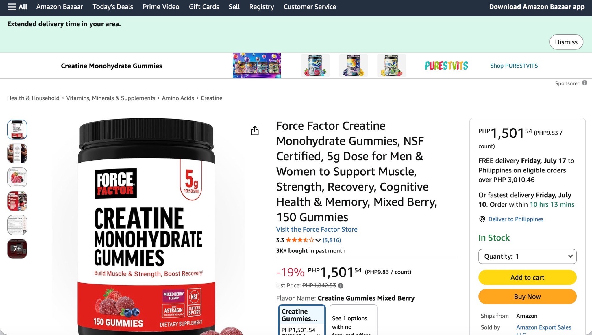
Main Image: Win the Click First

Your main image controls a huge part of your click-through rate.
If shoppers never click, the rest of your listing does not get a chance.
Your main image needs to be:
Clear
Clean
Easy to understand
Properly cropped
Competitive on the search page
Strong on mobile
Accurate to what the customer receives
Better than the products around it
The biggest mistake is judging your main image by itself.
Do not do that.
Search your main keyword and compare your image against the products on page one.
Ask yourself:
Does mine stand out?
Does it look premium?
Does it look clear on mobile?
Does it communicate what the product is?
Would I click it if I were the shopper?
If the main image is weak, your CTR suffers.
If CTR suffers, you get fewer shoppers into the listing.
So before you blame PPC, check the main image first.
I go deeper on this in the Amazon Main Image Optimization Guide, where I break down how to improve CTR and get more qualified shoppers into your listing.
Product Images: Your Gallery Has to Do the Selling

Once someone clicks, your product images need to sell.
The customer cannot touch your product.
They cannot hold it.
They cannot smell it.
They cannot see it in person.
So your gallery images have to do the work.
Your image stack should answer:
What is this?
Who is it for?
What problem does it solve?
How does it work?
What is included?
What size is it?
What makes it different?
Why should I trust it?
Why should I buy this instead of the competitor?
If your gallery is just a few product angles on a white background, you are probably leaving money on the table.
You need images that explain.
That means:
Infographics
Lifestyle images
Product-in-use photos
Comparison charts
Size and scale images
Ingredient or material breakdowns
What’s-included images
Review/social proof images
Objection-handling images
The customer should understand almost everything important about the product just by looking through the images.
Title and Bullets: Make Them Easy to Read

A good Amazon title should do three things:
Easy to read. USP-focused. SEO-optimized.
In that order.
A lot of sellers reverse it and stuff every keyword possible into the title until it reads like garbage.
Yes, keywords matter.
But the shopper still needs to understand what the product is.
Especially on mobile, where they may only see the first part of the title.
The same goes for bullet points.
Most shoppers do not read giant bullet paragraphs.
They skim.
So your bullets should be:
Benefit-led
Short enough to scan
Clear on mobile
Keyword-rich, but natural
Focused on why the feature matters
Do not just list features.
Explain the benefit.
Feature:
Made with stainless steel.
Better:
Durable stainless steel design built to last through daily use.
Feature:
Includes three forms of magnesium.
Better:
Three forms of magnesium designed to support relaxation, sleep, and muscle recovery.
Features tell people what the product has.
Benefits tell them why they should care.
If your whole listing needs a cleanup, not just the images, the Amazon Listing Optimization Guide is the one I’d read after this. Conversion is not one thing. It’s the title, bullets, images, price, reviews, A+ Content, and how clearly the whole page sells your USP.
A+ Content and Premium A+: Seal the Deal

A+ Content is not decoration.
Premium A+ is not decoration.
This is where you sell the product.
If someone scrolls down to your A+ Content, they are still evaluating. They may be interested, but they still need more confidence.
Your A+ should help them say:
“Yep, this is the one.”
A strong A+ section should:
Communicate the USP fast
Explain why the product is different
Show the product in use
Build trust
Answer objections
Compare your product against alternatives
Cross-sell related products
Make the product feel premium
If you have Premium A+ access, use it.
Premium A+ gives you more space, stronger visuals, video modules, better comparison sections, and a more premium shopping experience.
But do not use it just to make the page look fancy.
Use it to remove doubt.
Use it to simplify the decision.
Use it to explain why your product is the best choice.
I broke this down further in the Premium A+ Content Guide, especially how to use A+ modules to answer objections, build trust, and turn your Amazon page into more of a conversion-focused landing page.
Comparison Charts: Make the Decision Easy

Amazon is a comparison platform.
So you should make comparison easy.
A good comparison chart helps shoppers understand:
Why you are different
Why you are better
Which product is right for them
Why they should stay within your brand
What competitors are missing
Do not waste comparison charts on boring details only.
Use them to compare what actually matters.
For a supplement, that might be:
Dose
Ingredient quality
Forms used
Sugar content
Servings
Testing
Use case
For a pet product, that might be:
Size
Material
Safety
Comfort
Washability
Durability
Best use case
If you do not help shoppers compare, they will compare on their own.
And when they compare on their own, they may leave your page.
Social Proof: Reviews Are Not the Only Trust Signal
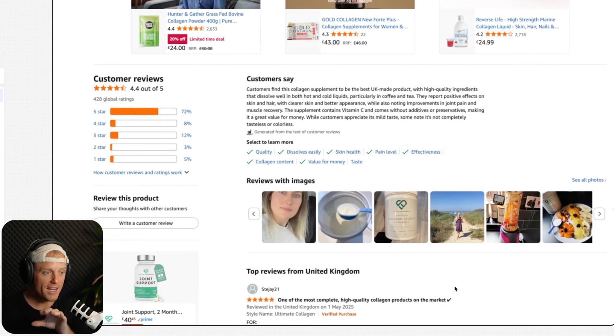
Reviews matter a ton.
If your star rating is weak, fix that first.
A 4.3 rating feels very different from a 3.7 rating.
But reviews are not the only trust signal you can use.
You can also add:
Review quote collages
UGC screenshots
Customer testimonial videos
Media mentions
“Loved by 10,000+ customers” messaging
Founder story
Brand story
Before/after examples, where compliant
Product-in-use proof
One of my favorite things is a review or UGC collage.
But do not just paste a wall of tiny review text.
Make it skimmable.
Turn the best points into headline-style proof.
For example:
“Finally helped my dog sleep through the night.”
“Tastes way better than other greens powders.”
“The only magnesium that didn’t upset my stomach.”
That type of proof can do a lot of selling.
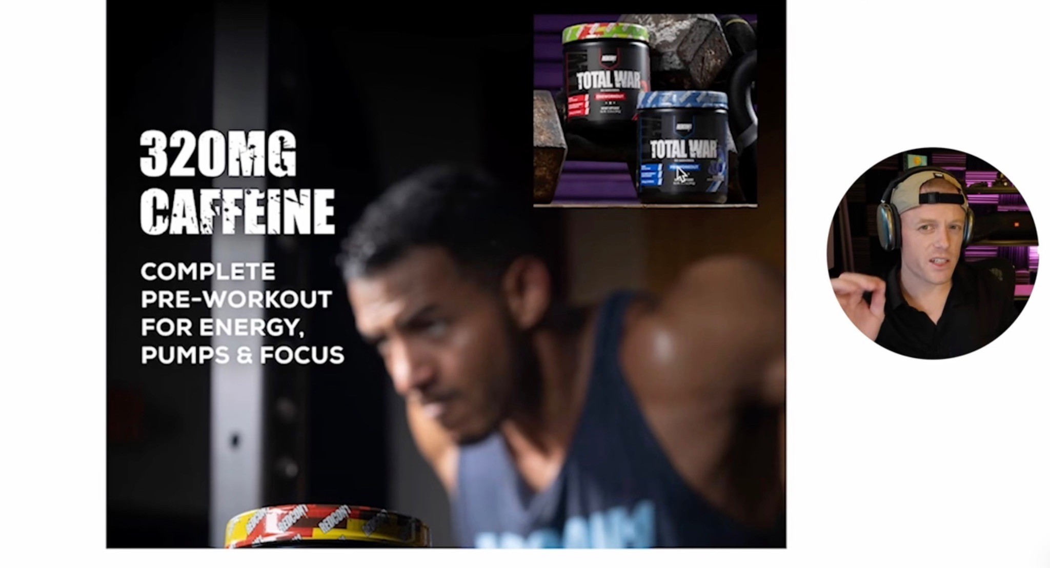
Videos: Explain the Product Faster
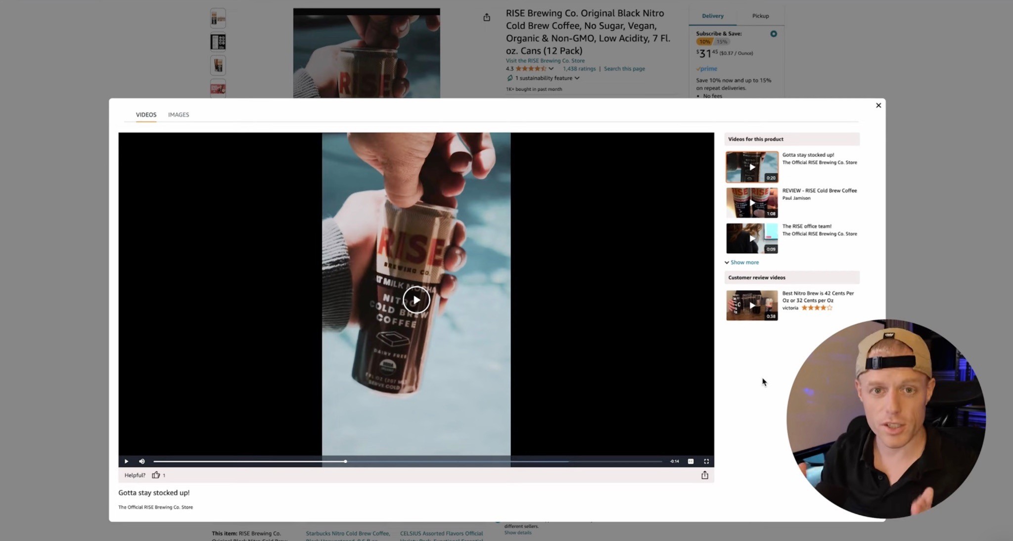
If you do not have videos on your listing, you are missing a major conversion lever.
At minimum, think about three video types:
Main product commercial
Long-form product explanation
UGC/customer-style video
Your main video should quickly show the product, the USP, and the main benefits.
Your long-form video can be more casual. As the founder or brand owner, you can literally take out your phone and talk about the product for five to ten minutes.
Explain:
Why you created it
Who it is for
How it works
What makes it different
How to use it
What customers should know
Then you want UGC-style videos from real people using the product.
That builds trust because shoppers trust people more than polished brand copy.
Video makes the product feel real.
And on Amazon, that matters.
Pricing, Reviews, and Offer: Do Not Ignore the Obvious

Sometimes the creative is not the only issue.
Sometimes your offer is not competitive.
If your product has 10 reviews and your competitor has 5,000 reviews, it is going to be hard to charge the same price unless your page makes the value extremely obvious.
That does not mean you always need to be the cheapest.
I do not believe in racing to the bottom.
But your price has to match your position.
The same goes for reviews.
If your product rating is bad, no amount of beautiful A+ Content fully fixes that.
Look at the reviews and ask:
Are customers confused?
Is the product underdelivering?
Is the size unclear?
Is the packaging bad?
Is the listing overpromising?
Are people using the product wrong?
Is there a quality issue?
Sometimes CRO means fixing the product, not just the page.
The Six Pillars of a High-Converting Amazon Page

Here is the simple framework I like.
1. USP-Focused
Can shoppers understand why you are different fast?
2. Comparison-Focused
Are you helping shoppers choose you over the other options?
3. Stupid Simple
Is the page easy to skim and understand?
4. Video-Driven
Do you have videos that explain, prove, and sell the product?
5. Strong Photography
Does the product look real, premium, and trustworthy?
6. Million-Dollar Branding
Does your brand look like it belongs in the category?
If you want to increase Amazon sales without spending more on PPC, start here.
Amazon CRO Audit Checklist
Before spending more on ads, run through this checklist.
Data
Do you know your conversion rate?
Do you know your CTR?
Do you know your ACOS and TACOS?
Do you know your top organic keywords?
Do you know which product is your 80/20 revenue driver?
Search Page
Is your main image competitive?
Is your title easy to understand?
Does your price make sense?
Do your reviews support the click?
Do you stand out on mobile?
Product Page
Is the USP obvious in three seconds?
Do your images explain the product?
Are your bullets benefit-led?
Does your A+ Content actually sell?
Do you have a comparison chart?
Do you have strong social proof?
Do you have videos?
Is the page easy to understand on mobile?
Trust and Offer
Is your star rating strong?
Do you have enough reviews?
Are you showing customer proof?
Does your branding look premium?
Is your price justified?
Are you using coupons or Subscribe & Save strategically where relevant?
If these are weak, fix the listing before scaling PPC.
And if you’re specifically getting clicks but shoppers still are not buying, I’d read the guide on why Amazon listings get clicks but no sales. That article goes deeper into what usually breaks after the click.
What Not to Do

Do not just add more text.
Do not make every infographic crowded.
Do not copy your website messaging.
Do not sell the category instead of the USP.
Do not assume pretty design equals conversion.
Do not ignore mobile.
Do not keep spending more on PPC if the listing is not converting.
Do not bury your best selling points.
Amazon shoppers are moving fast.
Make the decision easy.
FAQ
What is Amazon conversion rate optimization?
Amazon conversion rate optimization is the process of improving your product detail page so more shoppers who visit the listing actually buy. It includes optimizing your main image, gallery images, title, bullets, reviews, price, videos, A+ Content, Premium A+ Content, Brand Story, comparison charts, and messaging.
How do I increase Amazon sales without increasing PPC spend?
Improve the conversion rate of the traffic you already have. If more of your existing visitors buy, sales can increase without needing to spend more on ads.
Why is my Amazon listing getting traffic but no sales?
If your listing gets traffic but no sales, you likely have a conversion problem. Common issues include weak images, unclear USP, low trust, bad reviews, weak A+ Content, poor pricing, confusing bullets, or traffic that does not match the product.
What should I optimize first on my Amazon listing?
Start with the bottleneck. If impressions are high but clicks are low, look at the main image and title. If clicks are happening but sales are low, look at the product images, reviews, pricing, A+ Content, social proof, and overall messaging.
Does A+ Content increase conversion rate?
A+ Content can help conversion when it explains the product, answers objections, builds trust, and makes the buying decision easier. It should not just be used as decoration.
Should I spend more on PPC or improve my listing first?
If your listing does not convert well, improve the listing first. PPC drives traffic, but the listing has to convert that traffic. Otherwise, more PPC just wastes more money.
Summary
If you want to increase Amazon sales without spending more on PPC, focus on conversion rate.
Your Amazon listing is not just a product page.
It is the sales page.
It is the decision page.
It is where shoppers compare you against everyone else.
So make the decision easy.
Lead with your USP.
Use a main image that earns the click.
Build a gallery that explains the product.
Use A+ and Premium A+ to remove doubt.
Add comparison charts.
Show social proof.
Use videos.
Improve reviews and trust.
Make the price feel worth it.
And remember:
PPC amplifies what is already happening.
If your listing converts, PPC can scale it.
If your listing does not convert, PPC just makes the problem more expensive.
That is why Amazon CRO is one of the best investments you can make.
Want Someone to Help You Figure Out Why Your Listing Isn’t Converting?
If your listing is getting traffic but not enough sales, something on the page is probably creating friction.
Maybe the USP is not clear enough.
Maybe the images are not doing enough selling.
Maybe the A+ Content looks nice but does not actually explain why your product is the better choice.
Maybe shoppers are clicking in, comparing you to competitors, and leaving.
That’s the stuff we look at every day at AmazingCreative.
We help Amazon brands turn their listings into conversion-focused pages, not just prettier pages. Main images, listing image stacks, Premium A+ Content, product photography direction, videos, comparison charts, social proof modules, Brand Story, and the messaging that makes the buying decision easier.
The goal is simple:
Get more of the shoppers already visiting your page to actually buy.
And when your page converts better, your PPC usually works better too.
If you want us to take a look, book an Amazon creative strategy call by clicking the button below and we’ll help figure out what might be holding your conversion rate back.