Amazon Premium A+ Content Guide: Layouts, Strategy, Examples, and Conversion Tips
Written By: Riley Bennett

If you have access to Premium A+ Content on Amazon, use it.
Seriously.
Premium A+ is one of the biggest opportunities most brands are still not using properly because it gives you way more room to sell the product.
You get larger image blocks.
You get video modules.
You get carousels.
You get hotspots.
You get Q&A dropdowns.
You get better comparison sections.
And when it’s done well, it makes your Amazon listing feel way more like a real landing page instead of just another basic product page.
That matters because Amazon is a comparison platform.
Shoppers are not only looking at you.
They are looking at your competitors too.
So the job of your Premium A+ Content is simple:
Help the shopper understand why your product is the best choice.
Not just what the product is.
Why yours.
That’s the part most brands miss.
Quick Answer: What Is Amazon Premium A+ Content?
Amazon Premium A+ Content is an upgraded version of regular A+ Content that gives brand-registered sellers access to larger and more interactive content modules on the product detail page.
Compared to basic A+ Content, Premium A+ can include:
Larger full-width image modules
Video modules
Multiple video placements
Image carousels
Interactive hotspot modules
Enhanced comparison charts
Q&A dropdowns
More premium-looking layouts
Better desktop and mobile formatting
The biggest reason I recommend it is video.
Being able to put video inside your A+ section is a game changer for conversion rate.
But video is not the only reason Premium A+ works.
The real opportunity is that you can explain your product better, show your best visuals, build trust, compare against competitors, and keep shoppers engaged longer on the page.
Why Premium A+ Content Matters
A lot of shoppers will look at your product images, skim the title, check the reviews, and then scroll.
For some shoppers, the A+ section might be one of your last chances to stop the scroll before they go straight to reviews or leave the listing.
So if your A+ Content is weak, generic, or hard to read, you’re wasting that real estate.
Premium A+ gives you more space to do the thing Amazon listings need to do better:
Make the buying decision easier.
A good Premium A+ section should help answer questions like:
What is this product?
Who is it for?
Why is it different?
Why is it better than the alternatives?
What are the most important features?
How do I use it?
What results or benefits should I understand?
Can I trust this brand?
What else does this brand sell?
That is why I think of Premium A+ like a mini landing page inside your Amazon listing.
It is not there to look pretty.
It is there to convert.
Premium A+ is one piece of the bigger conversion puzzle. If you want the full breakdown of how I think about improving the whole product page, I’d read the Amazon Conversion Rate Optimization Guide next.
Basic A+ vs Premium A+ Content

Basic A+ Content can still work, but it has limitations.
With regular A+ Content, you usually have stacked banners and modules that do not fully take over the page. There can be awkward white space between sections, and the design often feels more broken up.
Premium A+ feels more seamless.
The modules can run wider across the page, the images feel bigger, and the whole section can look more like a premium DTC landing page built directly into Amazon.
That difference matters.
When shoppers see a Premium A+ section that looks clean, big, and easy to understand, it immediately feels more legit.
It gives the product a higher perceived value.
And if the messaging is clear, it can make the buying decision much easier.
The Goal of Premium A+ Content

The goal is not to add every fancy module Amazon gives you.
The goal is to sell better.
That means every module should have a job.
Some modules should explain the USP.
Some should show the product in use.
Some should build trust.
Some should answer objections.
Some should compare you against competitors.
Some should cross-sell your other products.
Some should show UGC, testimonials, or customer proof.
But do not add sliders, hotspots, and videos just because they look cool.
That is how you end up with a fancy page that still does not convert.
Premium A+ should be simple, skimmable, and conversion-focused.
The Most Important Premium A+ Strategy: Explain Why You’re Different

This is the biggest thing most brands are not doing.
They explain the product.
They explain the category.
They explain generic benefits.
But they do not explain why their product is the better choice.
That is a problem because Amazon shoppers already know the general benefit of the product.
If someone is shopping for creatine gummies, they already know they want creatine gummies.
If someone is shopping for omega-3, they already know they want omega-3.
If someone is shopping for dog supplements, they already know they want something for their dog.
Your job is not just to say, “Here’s what this product does.”
Your job is to say:
“Here’s why this one is the best choice.”
That should show up throughout the page.
Especially in:
The first hero module
The comparison chart
The ingredient or feature breakdown
The video
The UGC/review module
The final cross-sell or product lineup module
Amazon is a comparison platform.
So compare.
Show the shopper why you are different and better.
Premium A+ Layout: The Ideal Module Flow
There is no one perfect Premium A+ layout for every product, but here’s a strong structure I’d start with.
Module 1: Big USP Hero

Start with the clearest, strongest product idea.
This is your billboard.
Do not overcomplicate it.
Use a big headline, strong image, and simple supporting copy.
Think:
“The Smart Pill for a Sharper You”
“The Ultimate Cognitive Clarity Formula”
“Better Omega-3 Without the Fishy Burps”
“Daily Joint Support Dogs Actually Love”
The first module should instantly answer:
“What is this and why should I care?”
Use big text.
Use a strong visual.
Do not make shoppers work.
Module 2: Featured Video

Put your best video front and center.
This could be:
Founder video
Product demo
UGC compilation
Customer testimonial video
How-to-use video
Brand story video
Before/after style explanation, if allowed for the category
The video does not need to be some $20,000 production.
A strong UGC-style eCommerce video can work great if it explains the product clearly and feels believable.
The key is to use video to make the product easier to understand.
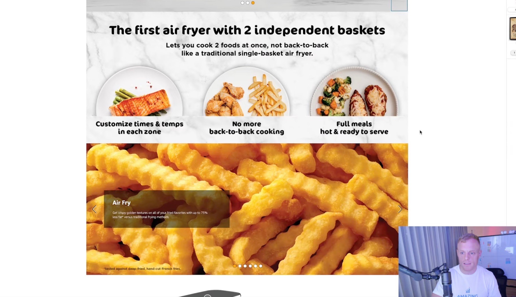
Module 3: Why It Works / Key Features
This is where you break down the most important product features.
For supplements, this might be ingredients, milligrams, formula, benefits, or certifications.
For beauty, it might be ingredients, use case, texture, skin type, or results.
For pet products, it might be dosage, active ingredients, flavor, life stage, or problem solved.
Keep it simple.
Use big headers.
Use short copy.
If the shopper has to read a giant paragraph to understand the product, you lost them.
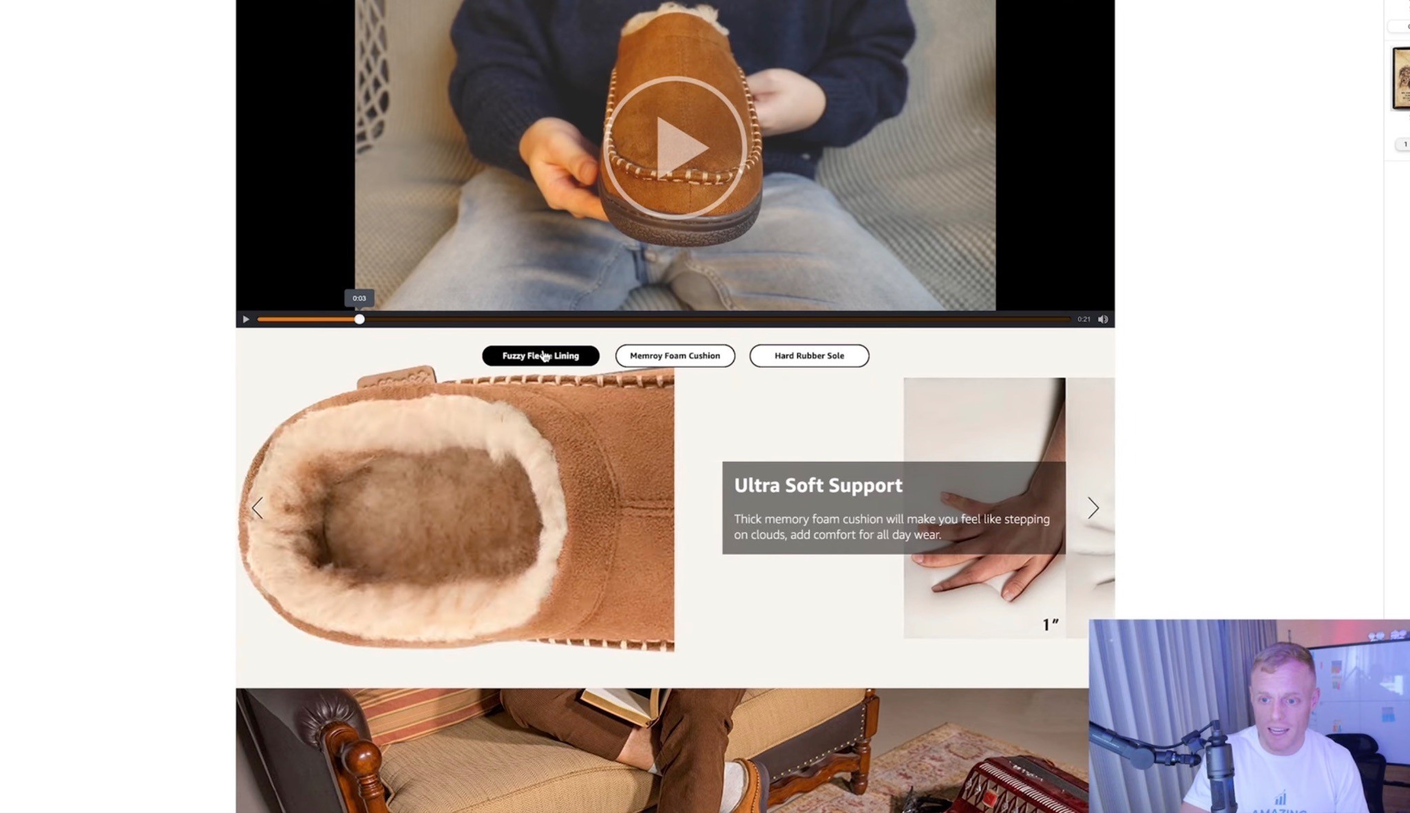
Module 4: Interactive Hotspot or Ingredient Breakdown

Premium A+ gives you hotspot modules where shoppers can hover over different parts of the image and learn more.
This can be great for:
Ingredients
Product parts
Formula breakdowns
Technical features
Bundle contents
Use cases
Mechanisms of action
But again, do not use it just because it is interactive.
Use it when interaction helps the shopper understand faster.
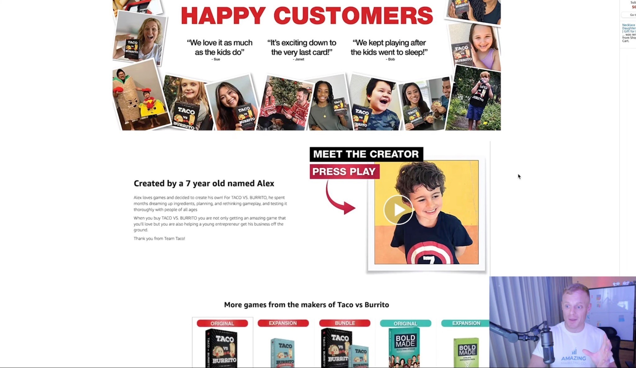
Module 5: UGC / Reviews / Social Proof

This is one of my favorite modules.
If you have happy customers, Instagram content, TikTok videos, review quotes, customer photos, or testimonial clips, put that on the page.
A strong UGC/review module can show:
Real customers using the product
Short review quotes
Before/after style proof, if category-compliant
Polaroid-style customer photos
Customer testimonial snippets
“Loved by X customers” style proof, if accurate
This works because shoppers trust other shoppers.
You can talk about how great your product is all day, but when real customers are saying it, that hits differently.
Module 6: Us vs. Them Comparison Chart

Every Premium A+ page should strongly consider a comparison chart.
This is where you make the difference obvious.
You can compare against:
Your old version
Generic competitors
Category alternatives
Common formulas
Similar products in your lineup
Top competitors, if you are comfortable and compliant
The point is to help shoppers understand why your product is the better choice.
A good comparison chart should be simple.
Not 19 rows of tiny text.
Just the most important reasons someone should choose you.
Module 7: Carousel / More Ways to Use It
Carousels are great when there is extra useful information that does not need to be in the first few modules.
Examples:
Different flavors
Different ways to use the product
Recipes
Product routines
Assembly steps
Use cases
Benefits by customer type
Product variations
A carousel should add value.
Not just exist to look fancy.
Module 8: Product Lineup / Cross-Sell

Use the end of the Premium A+ section to show your other products.
This is especially useful if you have:
Multiple flavors
Different formulas
Bundles
A product system
A full supplement line
Related products
A good/better/best product lineup
The shopper is already on your listing.
If this product is not the perfect fit, maybe another product in your catalog is.
Do not waste that opportunity.
Premium A+ Design Tips That Actually Matter
Use Large Image Blocks

Large image blocks are the best.
I have recommended this forever for A+ Content, and the same thing applies to Premium A+.
This is one of the few places on Amazon where you can show big, beautiful, high-impact visuals.
Use that.
Feature your best images here.
Show lifestyle.
Show close-ups.
Show the product in use.
Show the outcome.
Make the page feel premium.
Use Big Headers

Shoppers skim.
They are not reading every word.
So your headers need to do a lot of work.
A good header should explain the point of the module quickly.
Bad header:
“Premium Quality Ingredients”
Better header:
“Clean Energy Without the Jitters”
Bad header:
“Advanced Formula”
Better header:
“50mg Caffeine + L-Theanine for Smooth Focus”
Make the header useful.
Make it easy.
Make it obvious.
Keep Text Short
Big words.
Not too much text.
That is the rule.
You can include technical details where needed, especially for supplements or more complicated products, but the page still has to be skimmable.
Use:
Big headlines
Short supporting copy
Simple bullets
Visual hierarchy
Easy-to-read modules
Do not make people work too hard.
Design for Mobile and Desktop

Premium A+ lets you create desktop and mobile versions, so do not ignore mobile.
Shoppers on mobile are moving fast.
Text has to be readable.
Images have to be clear.
Modules need to make sense vertically.
If your beautiful desktop design turns into tiny unreadable text on mobile, it is not optimized.
Do Not Copy Other Amazon Listings Too Closely
This might sound weird, but I’m not a fan of using most Amazon listings as the creative benchmark.
Why?
Because a lot of Amazon listings are bad.
If you only look at what everyone else in the category is doing, you may end up copying average work.
Instead, think more like a premium eCommerce brand.
Look at the brand’s website.
Look at DTC landing pages.
Look at how good brands explain the product.
Then translate that into Amazon’s format.
That is the difference.
And if your whole listing needs work, not just the A+ section, the Amazon Listing Optimization Guide goes deeper into how to clean up the title, bullets, images, messaging, and overall page structure.
How to Build Premium A+ Content From a Website

One of the easiest ways to start a Premium A+ build is to look at the brand’s website.
Usually, the website already has some version of the product story.
Your job is to pull out the best parts and turn them into Amazon modules.
The process looks like this:
Understand the product
Identify the USP
Study the website
Find the clearest messaging
Look for the best visuals
Pull out the strongest proof points
Turn everything into 7–8 Premium A+ modules
Simplify the messaging for Amazon shoppers

But do not just copy and paste the website.
That is the easy version.
The better version is taking what already exists and making it clearer, simpler, and more conversion-focused for Amazon.
A website visitor may be browsing the brand.
An Amazon shopper is comparing products.
That is a different mindset.
So the messaging has to be sharper.
I actually walked through this process in my video, Premium A+ Training: How I Turned This Brand's Website into a Killer Amazon Page, where I show how I think through the product, pull ideas from the brand’s website, and turn that into Premium A+ modules built for Amazon shoppers.
What to Put in Premium A+ Content
Here are the elements I’d consider adding.
Video

Put your best video content forward.
Use:
Founder video
Product demo
UGC clips
Review compilation
Explainer video
Lifestyle video
Testimonial highlights
If you have multiple good videos, Premium A+ can support more than one video module or video-style placement depending on the module setup.\
And if you’re already creating strong product videos for Premium A+, you can usually repurpose some of that thinking for ads too. The Amazon Sponsored Brands Video Ads Guide goes deeper into hooks, creative angles, and how to make videos that actually stop the scroll.
UGC and Review Quotes
If you have real customers using the product, show them.
This can work especially well in a Polaroid-style module with short quotes.
Think:
Customer photos
Short review snippets
Instagram content
TikTok content
Happy customer quotes
Testimonial highlights
This helps build trust without making the page feel like a corporate brochure.
Comparison Chart

This is where you make the buying decision obvious.
A good comparison chart can show:
Why your formula is better
Why your product has more value
Why your ingredients matter
Why your product is different from competitors
Why your full product line has options for different needs
The comparison chart should be clear, not overwhelming.
Product Lineup

If you have more than one product, show the lineup.
This helps cross-sell and keeps shoppers inside your brand.
You can use this for:
Flavors
Sizes
Bundles
Product variants
Complementary products
Good/better/best options
Ingredient or Feature Breakdown

For supplements, beauty, pet, food, and CPG, shoppers often want to know what is actually inside the product.
Make that easy.
Show:
Ingredients
Dosage
Benefits
Certifications
What each ingredient does
Why the formula is different
Do not hide important information in tiny text.
Brand Story

Brand Story helps build trust and is also part of unlocking Premium A+ eligibility.
But it should still be useful.
Do not make it just “we started this company because we care.”
Make it relevant to the buyer.
Why should they trust you?
Why did you create this product?
What problem are you solving better than everyone else?
Common Premium A+ Mistakes

Mistake 1: Making It Pretty But Not Clear
Pretty does not automatically mean high converting.
A beautiful page that does not explain the product clearly is still weak.
The shopper should understand the product faster after reading your Premium A+.
Not be more confused.
Mistake 2: Too Much Text
This is probably the most common mistake.
Big blocks of text do not work well on Amazon.
Use big headers and short copy.
If you need technical information, make it visual.
Mistake 3: No “Why We’re Different”
Most brands explain what the product does, but not why theirs is better.
That is the whole point.
Amazon shoppers are comparing.
Give them the comparison.
Mistake 4: Weak Video Placement
If video is one of the biggest benefits of Premium A+, do not bury it.
Put the main video high enough on the page that people actually see it.
Use a strong thumbnail that makes people want to click.
Mistake 5: Ignoring Mobile
If the mobile version is hard to read, you have a problem.
Always check mobile.
Mistake 6: Using Interactive Modules for No Reason
Carousels, hotspots, and dropdowns are great when they help the shopper.
They are not great when they are just there to look fancy.
Mistake 7: Not Testing
Do not assume your Premium A+ is perfect.
Test it.
Use Manage Your Experiments when possible, or manually track performance if the experiment results look weird or inconclusive.
How to Unlock Premium A+ Content

At the time of writing, Amazon says you need two main things to be eligible for Premium A+:
A published Brand Story for all catalog ASINs
Five or more approved A+ Content projects in the past 12 months
You also need to be brand registered.
If you do not have Brand Story set up yet, do that first.
It does not need to be the most amazing Brand Story in the world just to unlock eligibility.
You can use a simple version with lifestyle imagery as a placeholder, get it approved, and improve it later.
Same thing with regular A+ Content.
If you do not have polished A+ built yet, create simple A+ projects, submit them, and get them approved.
Then once Premium A+ is unlocked, go back and build the real premium version properly.
One important note: older videos and tutorials may mention 15 A+ submissions. Amazon’s current guidance is five approved A+ projects in the past 12 months, so always check Seller Central for the latest requirements before doing the work.
Is Premium A+ Content Free?
At the time of writing, Premium A+ is available at no cost during Amazon’s promotional period for eligible sellers.
That could change later.
So if you have access, I would not wait around.
Claim it, build it, and start testing it.
How to Test Premium A+ Content

You can test A+ Content inside Amazon Manage Your Experiments if your ASIN is eligible.
This is useful because you can compare your current A+ against a new Premium A+ version and see what performs better.
But test one thing at a time.
Do not test title, main image, product images, and A+ Content all at once unless you are doing a full rebrand and you do not care about isolating the data.
Why?
Because if the test wins or loses, you will not know what caused it.
Was it the title?
The images?
The A+?
The main image?
No idea.
So usually, test either:
Main image
Gallery images
Title
A+ Content
One at a time.
That is how you actually learn.
Also, if Amazon gives an inconclusive result or something that feels like a false negative, use your brain.
If the old A+ Content is basically a logo and a bad image, and the new version is a full premium landing-page style section, it may be worth manually testing the new content for a couple of weeks and watching the real business metrics.
Experiments are helpful.
They are not perfect.
Premium A+ Content Checklist
Before you publish Premium A+, run through this.
Strategy
Is the USP clear?
Does the first module explain the product fast?
Does the page explain why your product is different?
Does each module have a purpose?
Is there a clear comparison section?
Does the page answer major objections?
Design
Are the image blocks large and premium-looking?
Is the text easy to read?
Are the headers big?
Is the copy short?
Does the page feel seamless?
Does it work on mobile?
Are you using your best visuals?
Conversion
Is there a strong video module?
Is there UGC or customer proof?
Are there trust builders?
Is there a product lineup or cross-sell module?
Is the comparison chart easy to understand?
Does the page make the buying decision easier?
Testing
Did you test the A+ separately?
Did you avoid changing other major elements during the test?
Did you check both desktop and mobile?
Did you review performance after launch?
Are you willing to keep improving it?
FAQ
What is Amazon Premium A+ Content?
Amazon Premium A+ Content is an upgraded version of A+ Content that gives eligible brand-registered sellers access to larger, more interactive modules like videos, carousels, hotspots, Q&A dropdowns, enhanced comparison charts, and full-width image sections.
Is Premium A+ better than regular A+?
Yes, if it is done well. Premium A+ gives you more space, better design flexibility, and more interactive modules. But it still needs clear messaging and strong strategy. Premium modules alone do not fix weak positioning.
What is the biggest benefit of Premium A+ Content?
The biggest benefit is the ability to create a more landing-page-like shopping experience on Amazon. Video modules are a huge part of that, but the larger visuals, comparison charts, UGC, and cleaner structure are just as important.
How do you unlock Premium A+ Content?
At the time of writing, you need Brand Story published for all catalog ASINs and five or more approved A+ Content projects in the past 12 months. You also need to be brand registered.
Should every brand use Premium A+ Content?
If you have access, yes, I would strongly consider it. Especially if you are in supplements, health and wellness, food and beverage, beauty, pet, or CPG where shoppers need more education and trust before buying.
What should I include in Premium A+ Content?
Start with a strong USP hero, add a featured video, explain key features, include UGC or review proof, show a comparison chart, use carousels where helpful, and end with a product lineup or cross-sell module.
Does Premium A+ Content improve conversion rate?
It can, especially when it makes the product easier to understand and gives shoppers stronger reasons to buy. But the quality of the messaging and design matters more than simply having Premium A+ turned on.
Should I use a video in Premium A+?
Yes, if you have a good video. Video is one of the biggest reasons to use Premium A+. It can help explain the product, show it in use, build trust, and make the page feel more premium.
Should Premium A+ have a comparison chart?
In most cases, yes. Amazon is a comparison platform, so a good “us vs. them” or product comparison chart can help shoppers understand why your product is the better choice.
Summary
Premium A+ Content is not just a nicer-looking version of regular A+.
It is a chance to turn your Amazon listing into a real conversion-focused brand page.
Use the bigger image blocks.
Use video.
Use carousels when they help.
Use hotspots when they make the product easier to understand.
Use UGC.
Use comparison charts.
Use Brand Story.
But above all, make the message simple.
What is the product?
Why should someone care?
Why is yours different?
Why should they stay on your listing and buy this one now?
That is what Premium A+ should answer.
Not with giant paragraphs.
Not with random pretty graphics.
With clear, simple, high-converting modules that make the buying decision easier.
If you have access to Premium A+, get on it.
And if you do not have access yet, start with Brand Story, get your A+ projects approved, and unlock it.
This is one of the best things you can do to improve the quality of your Amazon listing right now.
Want Help Building Premium A+ That Actually Converts?
If you’re looking at Premium A+ and thinking, “Yeah… I have no idea what modules to use,” no shame in that.
This stuff gets specific fast.
It is not just making bigger banners or adding a video somewhere.
You have to understand the product, the shopper, the USP, the competitor set, what information needs to be simplified, what should be shown visually, and how to turn all of that into a page that actually helps people buy.
That is literally what we do at AmazingCreative Premium A+.
We help Amazon brands build Premium A+ Content that looks premium, but more importantly, makes the product easier to understand and easier to choose.
If you want us to take a look, click the button below to book an Amazon creative strategy call and we’ll help figure out what your Premium A+ should actually say, show, and sell.