Amazon Product Images: Requirements, Dimensions, and Gallery Examples
Follow Amazon’s rules and build a gallery that answers shoppers’ questions.

Amazon product images need to do two things:
Meet Amazon’s technical and content requirements.
Help shoppers understand why your product is the right choice.
A compliant image can still perform poorly if it looks blurry, feels cluttered, or fails to explain the product. At the same time, a creative image can be rejected if it breaks Amazon’s main-image rules.
This guide covers the current image requirements, recommended dimensions, main-image rules, and a practical gallery sequence you can use for most products.
Amazon Product Image Requirements at a Glance

Amazon requires every product to have at least one compliant main image. It recommends uploading at least six additional images and one product video, although the number and order shown to shoppers can vary by category, device, and Amazon’s current presentation.
For most Amazon product images, use these settings:
Requirement | Recommended Setup |
Image dimensions | 2,000 × 2,000 pixels |
Minimum longest side | 500 pixels |
Maximum longest side | 10,000 pixels |
Zoom | Use more than 1,000 pixels on the longest side |
Aspect ratio | Square, preferably 1:1 |
Preferred format | JPEG |
Other accepted formats | PNG, TIFF, and GIF where supported |
Color mode | RGB or CMYK |
Main-image background | Pure white: RGB 255, 255, 255 |
Product coverage | Around 85% or more of the frame |
Image quality | Clear, sharp, professionally lit, and accurately colored |
Amazon’s official image guide allows images from 500 to 10,000 pixels on the longest side and recommends images larger than 1,000 pixels so shoppers can use zoom.
I normally use 2,000 × 2,000 pixels because it provides enough detail for zoom while keeping every gallery asset consistent. I also recommends 2,000-pixel images and emphasizes making each image clear, large, and easy to inspect.
Amazon Main-Image Requirements

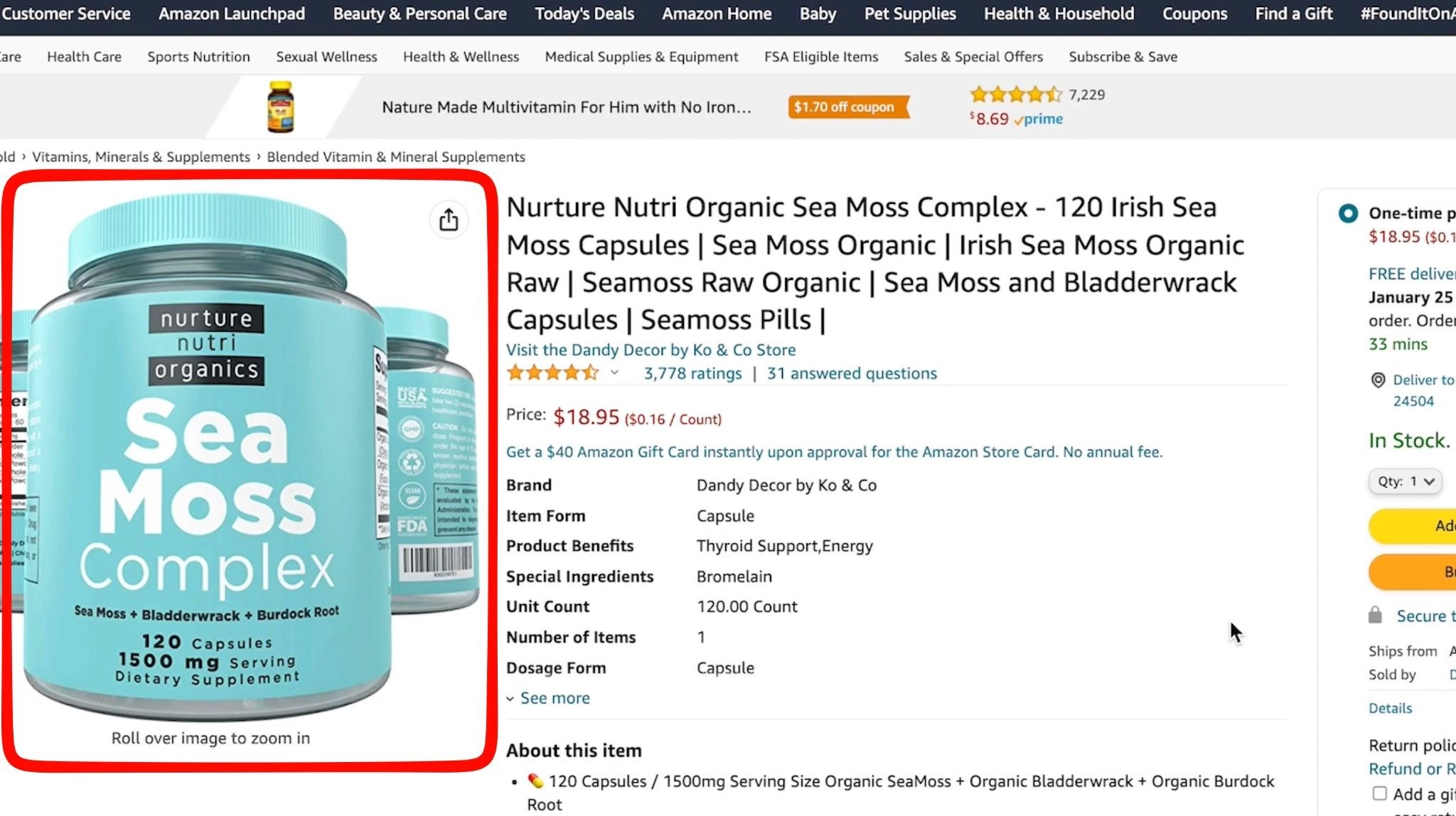
Your main image appears in search results and at the beginning of the product gallery, so Amazon applies stricter rules to it.
The main image should:
Show the actual product being sold
Use a pure white background
Display the product clearly and accurately
Show the correct color, quantity, and variation
Fill approximately 85% or more of the frame
Be sharp, well-lit, and professionally presented
Show only items included with the purchase
The main image generally should not include:
Added text
Badges or promotional graphics
Borders
Watermarks
Decorative backgrounds
Star ratings or review claims
Accessories that are not included
Misleading quantities
Props that could confuse shoppers
Illustrations instead of the actual product
Amazon also requires sellers to follow any additional category-specific image rules. Apparel, jewelry, furniture, books, and other categories may have different model, packaging, or presentation requirements.
Before publishing, open the image requirements for the exact category in Seller Central rather than assuming one rule applies to every product.
Should Amazon Images Be 2,000 × 2,000 Pixels?
Amazon does not require every product image to be exactly 2,000 × 2,000 pixels.
However, it is a reliable working size because it:
Supports detailed zoom
Produces a consistent square gallery
Gives designers enough resolution for mobile and desktop
Reduces the risk of blurry text and details
Leaves room for clean product crops
Amazon recommends images larger than 1,000 pixels on the longest side for zoom, while its accepted technical range extends up to 10,000 pixels.
Avoid uploading enormous files simply because Amazon accepts them. Bigger dimensions do not fix poor photography, weak focus, compression artifacts, or tiny text.
Start with a high-resolution original and export a clean, optimized JPEG rather than repeatedly saving and compressing the same file.
How Many Images Can an Amazon Listing Have?

Amazon recommends at least six additional product images alongside the main image, plus a video. However, the number of available or visibly displayed media positions can vary by product category and Amazon’s interface.
I recommend planning around six to nine gallery images, depending on the category. The important point is to use every useful slot available rather than adding filler just to reach a number.
Check the live listing on:
Desktop
Mobile browser
Amazon mobile app
Amazon may crop, reorder, compress, or display media differently across those environments.
A Practical Amazon Gallery Image Sequence
The best sequence depends on the product, but this structure works well for many listings.
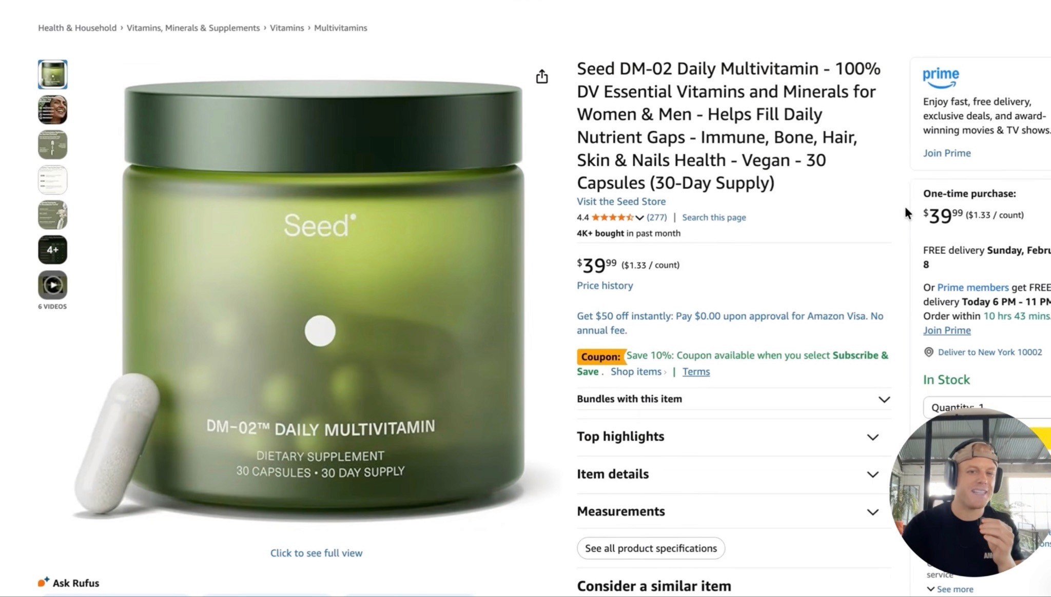
Image 1: Main Image

Show the product as clearly as possible.
The shopper should immediately understand:
What the product is
How much is included
Which variation they are viewing
Whether accessories or bundle items are included
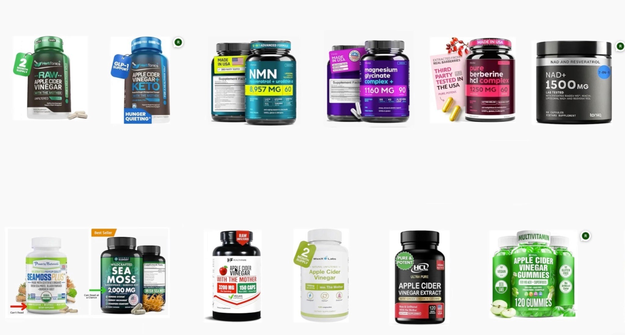
The main image should also look competitive at thumbnail size.
For more on improving search-page visibility, see my Amazon Main Image Optimization Guide.
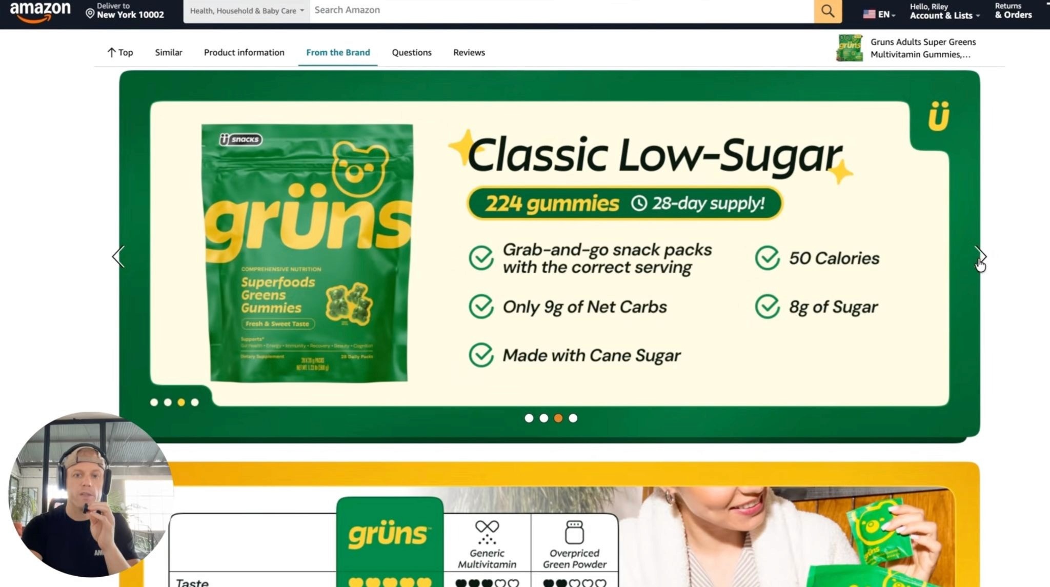
Image 2: Primary USP

Use the second image to explain the strongest reason to choose the product.
Examples:
More servings
Stronger material
Easier installation
Better formula
Larger capacity
Useful bundle
Cleaner ingredients
Use one large headline and one supporting visual.
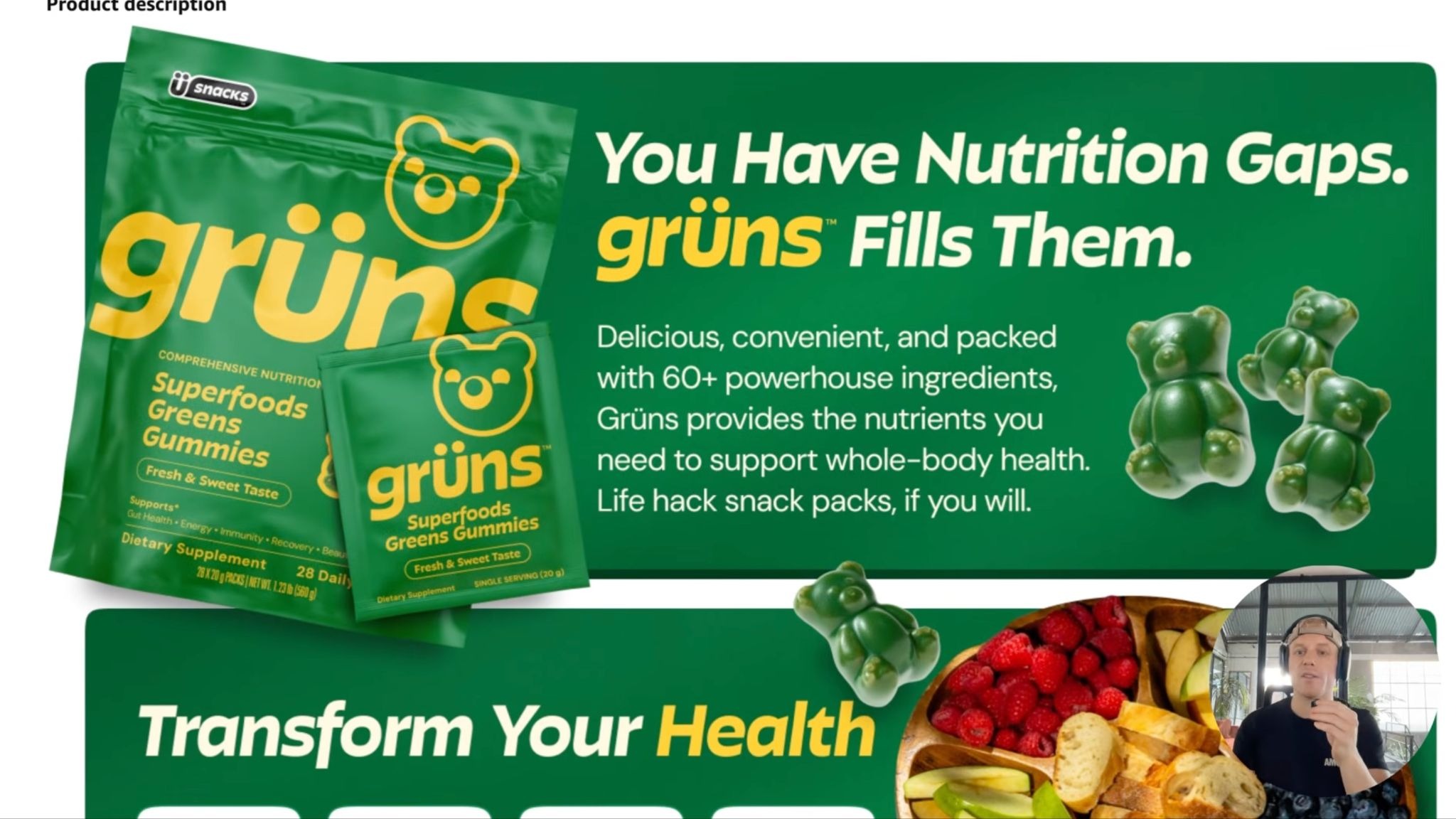
I recommend treating the gallery like a sequence of selling points, with each image communicating one clear idea rather than crowding several messages together.
Image 3: Features and Benefits

Explain how important features help the customer.
Do not stop at:
Stainless-steel construction
Explain the benefit:
Durable stainless steel that resists rust and everyday wear
A feature tells shoppers what the product has. A benefit explains why they should care.
Image 4: Product in Use

Show the product doing its job in a realistic environment.
Examples include:
A supplement being mixed
A storage product inside a cupboard
Clothing being worn
A tool being used
A kitchen product during preparation
A pet product with the intended animal
The scene should teach the shopper something, not simply show a model holding the package.
Image 5: Scale, Size, or Dimensions

Do not rely only on written measurements.
Show scale using:
A hand
A measuring guide
A familiar object
A room or intended environment
A model
Other available sizes
Scale images help reduce expectation gaps and may reduce returns.
Image 6: Close-Ups or How It Works
Use close-ups, zoom bubbles, or a simple process diagram to show:
Texture
Material
Stitching
Fasteners
Ports
Seals
Ingredients
Internal components
Installation steps
I recommend close-ups and feature-callout bubbles when the product’s quality or USP depends on details that are hard to see in the normal product shot.
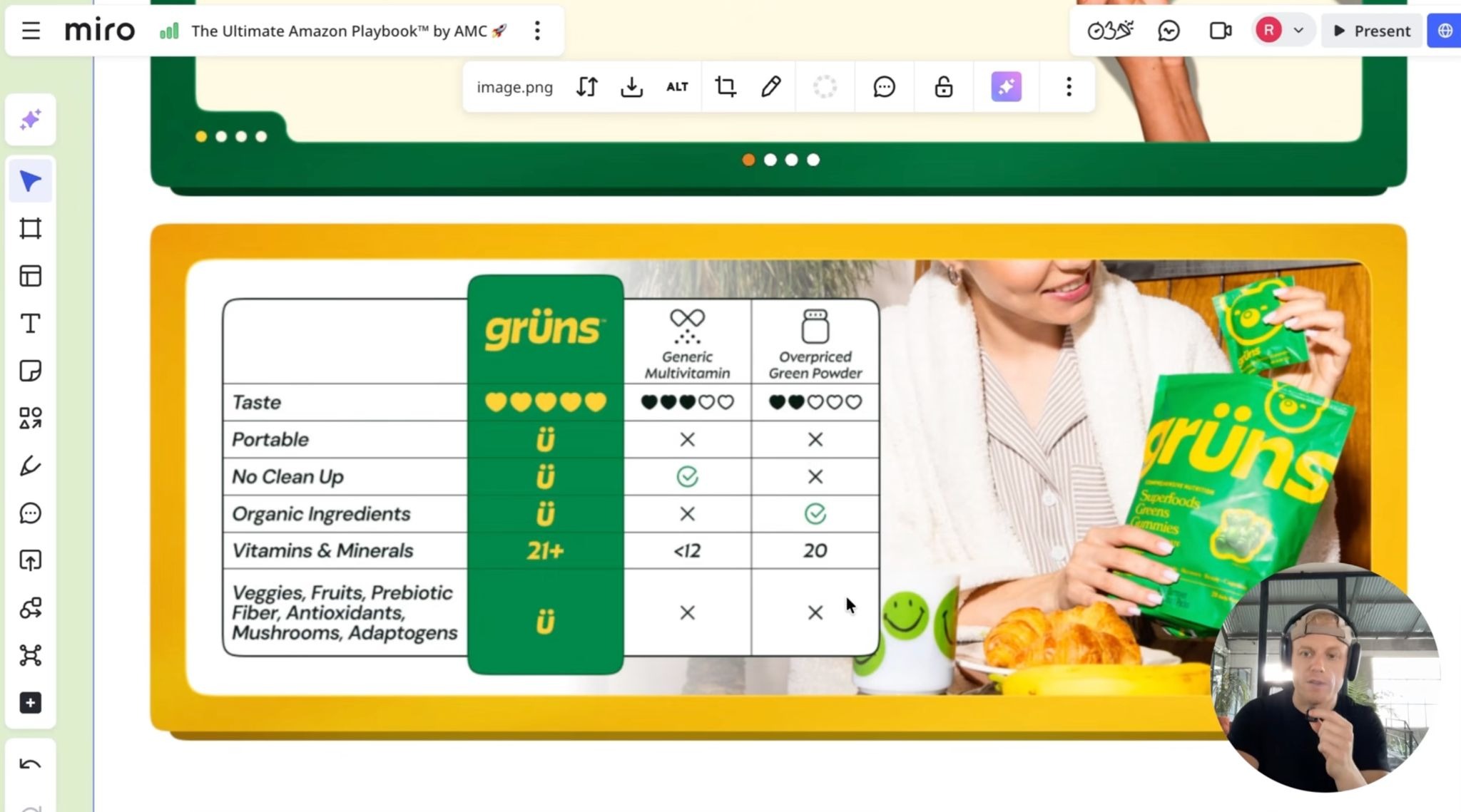
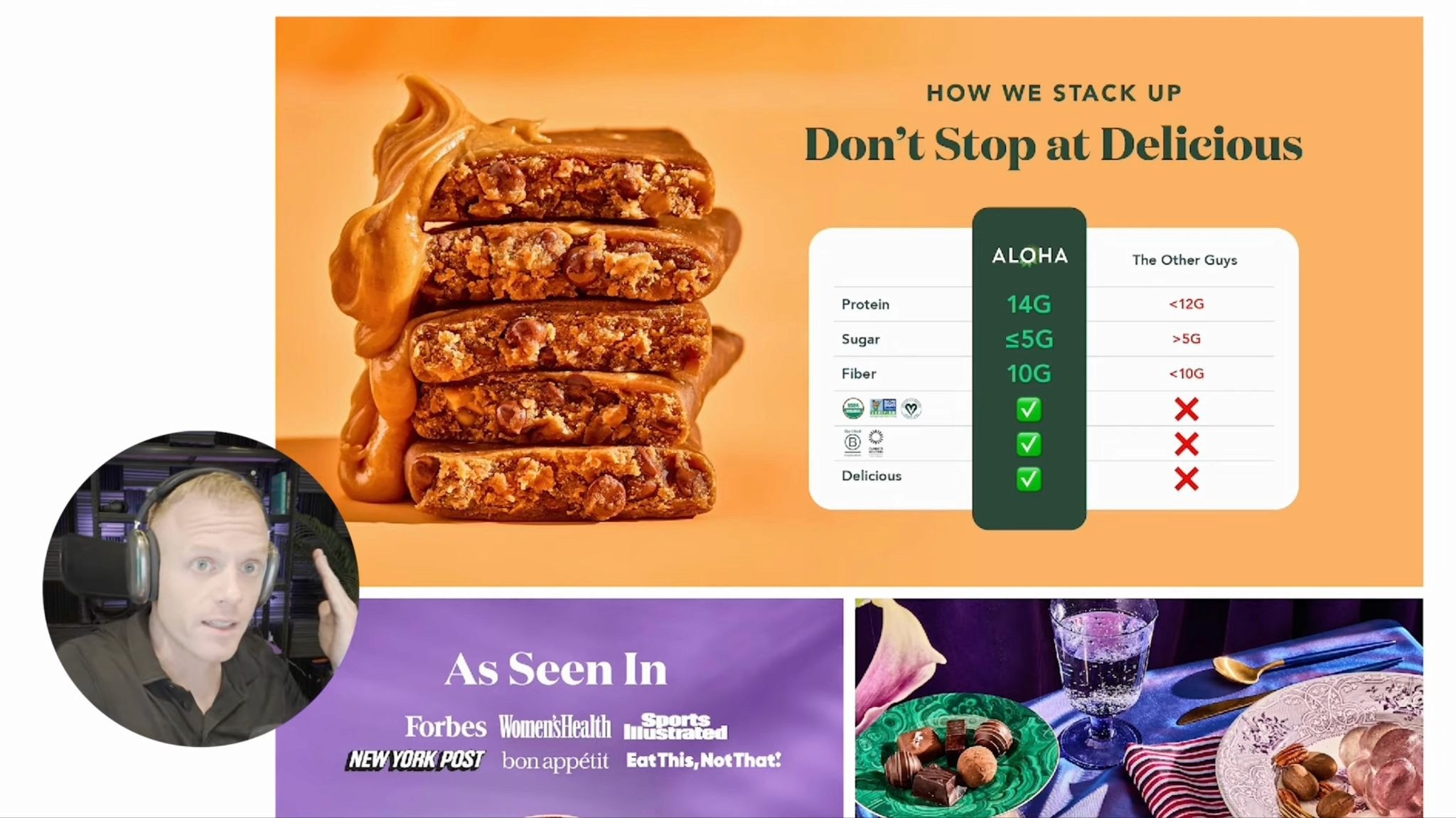
Image 7: Comparison or “Why Us?”

Amazon shoppers are already comparing your listing with alternatives.
A useful comparison image can show differences in:
Quantity
Material
Formula
Included accessories
Compatibility
Warranty
Testing
Product thickness
Ease of use
Keep comparisons accurate and supportable. Avoid misleading competitor claims or implying that another brand lacks a feature unless you can verify it.
I also recommend comparison graphics because they help shoppers understand the decision without bouncing between several listings.
Optional Images
Use extra positions for the information most relevant to the product:
Instructions
Packaging and bundle contents
Additional use cases
Ingredients or materials
UGC or customer proof
Certifications
Frequently asked questions
Product range
Compatibility
Before-and-after visuals where permitted
The goal is not to include every possible infographic type. It is to answer the questions most likely to block the purchase.
How Much Text Should Gallery Images Have?

Keep the main headline large enough to read on a phone.
A useful rule is:
One main idea per image
One short headline
One brief supporting sentence where needed
Only a few labels or icons
My gallery strategy consistently favors large words, short headlines, and one clear point per image.
Shoppers should understand the basic sales story by quickly swiping through the gallery without zooming into every graphic.
Beautiful design is not enough if the message takes too long to understand. Amazon shoppers compare products quickly, so clarity normally matters more than decorative complexity.
How to Prevent Blurry Amazon Images

Images can look blurry when:
The source photo is too small
Text was rasterized at a low resolution
The image was repeatedly compressed
A small image was enlarged
The export quality was too low
Amazon’s crop makes details smaller than expected
Too much information was placed in one design
To reduce blur:
Begin with a high-resolution source.
Design at 2,000 × 2,000 pixels.
Avoid enlarging small product images.
Export once from the original working file.
Use high-quality JPEG settings.
Keep text and icons large.
Review the uploaded image on the live listing.
Do not judge quality only from Seller Central’s upload preview. Check the actual detail page after Amazon processes the image.
Design Amazon Images for Mobile First
A gallery image that looks clean on a desktop monitor can become unreadable on a phone.
For mobile:
Use large headlines
Keep the product prominent
Avoid tiny comparison rows
Reduce supporting copy
Keep important details away from the edges
Use strong contrast
Preview the thumbnail size
Check whether arrows, dots, or interface elements cover anything important
Amazon does not guarantee that every image will appear identically across desktop, mobile web, and the app. Treat the final live presentation as part of quality assurance rather than assuming the square source file will always render perfectly.
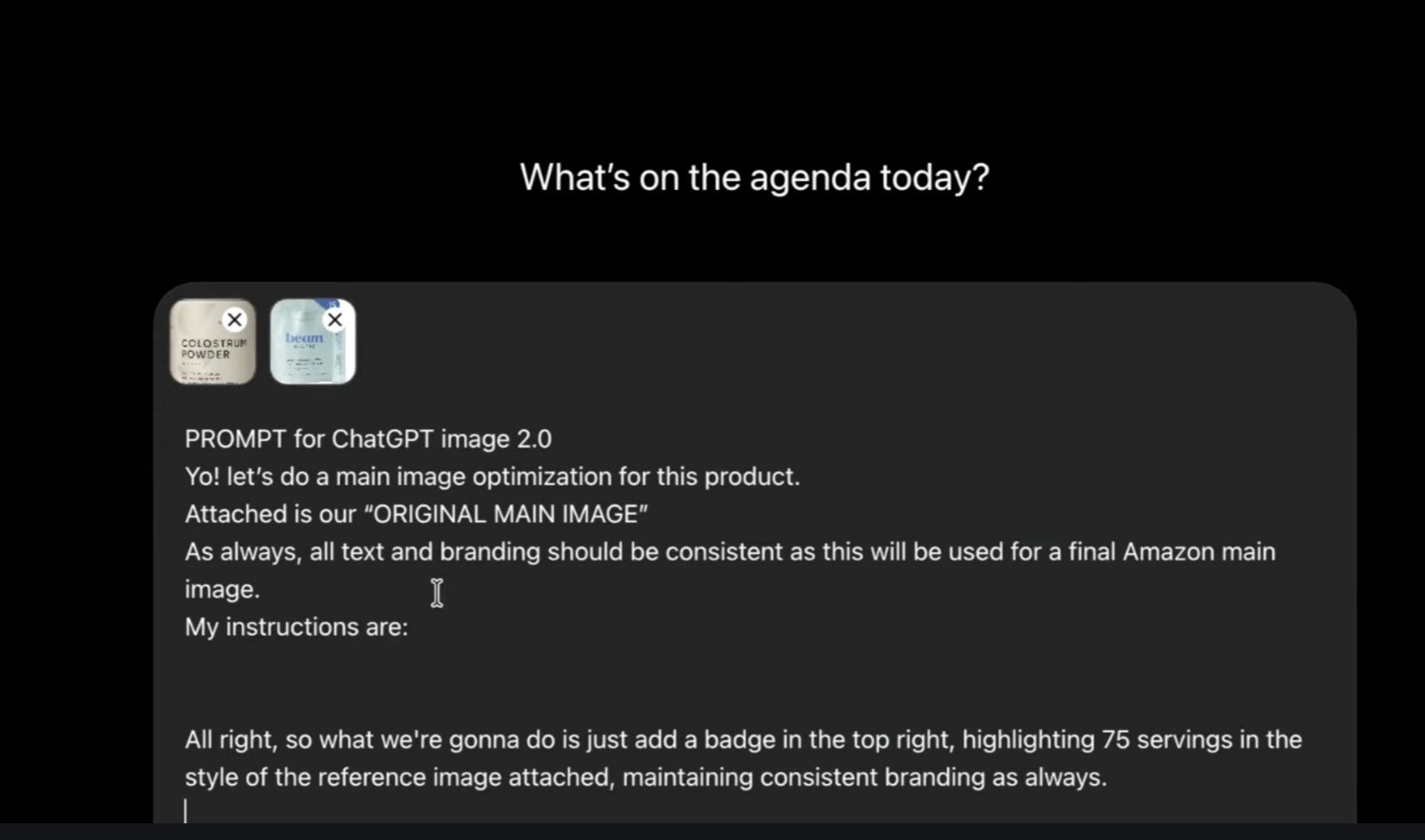
Should You Use AI-Generated Product Images?

AI can help create backgrounds, lifestyle concepts, props, and supporting scenes, but it should not alter the product itself in a misleading way.
Check carefully for:
Incorrect packaging
Changed labels
Added accessories
Wrong product proportions
Unrealistic usage
Distorted logos
Invented ingredients
Impossible shadows or scale
For products that require accurate texture, fit, packaging, or physical details, real photography is usually the safest foundation.
Our Amazon Product Photography service can produce the clean studio, close-up, packaging, and lifestyle assets needed for a complete gallery. For projects suited to generated environments or faster creative variations, our Amazon AI Photoshoot service can help build additional scenes while keeping the product presentation accurate.
Amazon Product Image Checklist
Before uploading, confirm that:
The main image uses a pure white background.
The product shown matches the correct ASIN and variation.
Only included items appear in the main image.
The product fills most of the frame.
Every image is clear and in focus.
Images are at least 1,000 pixels on the longest side for zoom.
The working files are preferably 2,000 × 2,000 pixels.
Each gallery image communicates one main point.
The gallery includes lifestyle, scale, detail, and comparison information where relevant.
Text remains readable on mobile.
Dimensions and claims are accurate.
Category-specific requirements have been checked.
The live desktop and mobile listings have been reviewed.
Build the Gallery Around the Buying Decision
Amazon product images are not just decoration.
The main image earns attention. The rest of the gallery needs to explain the product, communicate the USP, answer objections, demonstrate scale and quality, and make comparison easier.
A strong gallery usually follows a simple sequence:
Show the product. Explain the difference. Demonstrate it. Prove the value. Help the shopper choose.
For the photography behind a stronger gallery, my Amazon Product Photography Guide explains how to plan the studio shots, lifestyle scenes, close-ups, scale images, and product-in-use assets your listing needs.
Amazon Product Images: Requirements, Dimensions, and Gallery Examples
Follow Amazon’s rules and build a gallery that answers shoppers’ questions.

Amazon product images need to do two things:
Meet Amazon’s technical and content requirements.
Help shoppers understand why your product is the right choice.
A compliant image can still perform poorly if it looks blurry, feels cluttered, or fails to explain the product. At the same time, a creative image can be rejected if it breaks Amazon’s main-image rules.
This guide covers the current image requirements, recommended dimensions, main-image rules, and a practical gallery sequence you can use for most products.
Amazon Product Image Requirements at a Glance

Amazon requires every product to have at least one compliant main image. It recommends uploading at least six additional images and one product video, although the number and order shown to shoppers can vary by category, device, and Amazon’s current presentation.
For most Amazon product images, use these settings:
Requirement | Recommended Setup |
Image dimensions | 2,000 × 2,000 pixels |
Minimum longest side | 500 pixels |
Maximum longest side | 10,000 pixels |
Zoom | Use more than 1,000 pixels on the longest side |
Aspect ratio | Square, preferably 1:1 |
Preferred format | JPEG |
Other accepted formats | PNG, TIFF, and GIF where supported |
Color mode | RGB or CMYK |
Main-image background | Pure white: RGB 255, 255, 255 |
Product coverage | Around 85% or more of the frame |
Image quality | Clear, sharp, professionally lit, and accurately colored |
Amazon’s official image guide allows images from 500 to 10,000 pixels on the longest side and recommends images larger than 1,000 pixels so shoppers can use zoom.
I normally use 2,000 × 2,000 pixels because it provides enough detail for zoom while keeping every gallery asset consistent. I also recommends 2,000-pixel images and emphasizes making each image clear, large, and easy to inspect.
Amazon Main-Image Requirements

Your main image appears in search results and at the beginning of the product gallery, so Amazon applies stricter rules to it.
The main image should:
Show the actual product being sold
Use a pure white background
Display the product clearly and accurately
Show the correct color, quantity, and variation
Fill approximately 85% or more of the frame
Be sharp, well-lit, and professionally presented
Show only items included with the purchase
The main image generally should not include:
Added text
Badges or promotional graphics
Borders
Watermarks
Decorative backgrounds
Star ratings or review claims
Accessories that are not included
Misleading quantities
Props that could confuse shoppers
Illustrations instead of the actual product
Amazon also requires sellers to follow any additional category-specific image rules. Apparel, jewelry, furniture, books, and other categories may have different model, packaging, or presentation requirements.
Before publishing, open the image requirements for the exact category in Seller Central rather than assuming one rule applies to every product.
Should Amazon Images Be 2,000 × 2,000 Pixels?
Amazon does not require every product image to be exactly 2,000 × 2,000 pixels.
However, it is a reliable working size because it:
Supports detailed zoom
Produces a consistent square gallery
Gives designers enough resolution for mobile and desktop
Reduces the risk of blurry text and details
Leaves room for clean product crops
Amazon recommends images larger than 1,000 pixels on the longest side for zoom, while its accepted technical range extends up to 10,000 pixels.
Avoid uploading enormous files simply because Amazon accepts them. Bigger dimensions do not fix poor photography, weak focus, compression artifacts, or tiny text.
Start with a high-resolution original and export a clean, optimized JPEG rather than repeatedly saving and compressing the same file.
How Many Images Can an Amazon Listing Have?

Amazon recommends at least six additional product images alongside the main image, plus a video. However, the number of available or visibly displayed media positions can vary by product category and Amazon’s interface.
I recommend planning around six to nine gallery images, depending on the category. The important point is to use every useful slot available rather than adding filler just to reach a number.
Check the live listing on:
Desktop
Mobile browser
Amazon mobile app
Amazon may crop, reorder, compress, or display media differently across those environments.
A Practical Amazon Gallery Image Sequence
The best sequence depends on the product, but this structure works well for many listings.
Image 1: Main Image

Show the product as clearly as possible.
The shopper should immediately understand:
What the product is
How much is included
Which variation they are viewing
Whether accessories or bundle items are included
The main image should also look competitive at thumbnail size.
For more on improving search-page visibility, see my Amazon Main Image Optimization Guide.
Image 2: Primary USP

Use the second image to explain the strongest reason to choose the product.
Examples:
More servings
Stronger material
Easier installation
Better formula
Larger capacity
Useful bundle
Cleaner ingredients
Use one large headline and one supporting visual.
I recommend treating the gallery like a sequence of selling points, with each image communicating one clear idea rather than crowding several messages together.
Image 3: Features and Benefits

Explain how important features help the customer.
Do not stop at:
Stainless-steel construction
Explain the benefit:
Durable stainless steel that resists rust and everyday wear
A feature tells shoppers what the product has. A benefit explains why they should care.
Image 4: Product in Use

Show the product doing its job in a realistic environment.
Examples include:
A supplement being mixed
A storage product inside a cupboard
Clothing being worn
A tool being used
A kitchen product during preparation
A pet product with the intended animal
The scene should teach the shopper something, not simply show a model holding the package.
Image 5: Scale, Size, or Dimensions

Do not rely only on written measurements.
Show scale using:
A hand
A measuring guide
A familiar object
A room or intended environment
A model
Other available sizes
Scale images help reduce expectation gaps and may reduce returns.
Image 6: Close-Ups or How It Works
Use close-ups, zoom bubbles, or a simple process diagram to show:
Texture
Material
Stitching
Fasteners
Ports
Seals
Ingredients
Internal components
Installation steps
I recommend close-ups and feature-callout bubbles when the product’s quality or USP depends on details that are hard to see in the normal product shot.
Image 7: Comparison or “Why Us?”

Amazon shoppers are already comparing your listing with alternatives.
A useful comparison image can show differences in:
Quantity
Material
Formula
Included accessories
Compatibility
Warranty
Testing
Product thickness
Ease of use
Keep comparisons accurate and supportable. Avoid misleading competitor claims or implying that another brand lacks a feature unless you can verify it.
I also recommend comparison graphics because they help shoppers understand the decision without bouncing between several listings.
Optional Images
Use extra positions for the information most relevant to the product:
Instructions
Packaging and bundle contents
Additional use cases
Ingredients or materials
UGC or customer proof
Certifications
Frequently asked questions
Product range
Compatibility
Before-and-after visuals where permitted
The goal is not to include every possible infographic type. It is to answer the questions most likely to block the purchase.
How Much Text Should Gallery Images Have?

Keep the main headline large enough to read on a phone.
A useful rule is:
One main idea per image
One short headline
One brief supporting sentence where needed
Only a few labels or icons
My gallery strategy consistently favors large words, short headlines, and one clear point per image.
Shoppers should understand the basic sales story by quickly swiping through the gallery without zooming into every graphic.
Beautiful design is not enough if the message takes too long to understand. Amazon shoppers compare products quickly, so clarity normally matters more than decorative complexity.
How to Prevent Blurry Amazon Images

Images can look blurry when:
The source photo is too small
Text was rasterized at a low resolution
The image was repeatedly compressed
A small image was enlarged
The export quality was too low
Amazon’s crop makes details smaller than expected
Too much information was placed in one design
To reduce blur:
Begin with a high-resolution source.
Design at 2,000 × 2,000 pixels.
Avoid enlarging small product images.
Export once from the original working file.
Use high-quality JPEG settings.
Keep text and icons large.
Review the uploaded image on the live listing.
Do not judge quality only from Seller Central’s upload preview. Check the actual detail page after Amazon processes the image.
Design Amazon Images for Mobile First
A gallery image that looks clean on a desktop monitor can become unreadable on a phone.
For mobile:
Use large headlines
Keep the product prominent
Avoid tiny comparison rows
Reduce supporting copy
Keep important details away from the edges
Use strong contrast
Preview the thumbnail size
Check whether arrows, dots, or interface elements cover anything important
Amazon does not guarantee that every image will appear identically across desktop, mobile web, and the app. Treat the final live presentation as part of quality assurance rather than assuming the square source file will always render perfectly.
Should You Use AI-Generated Product Images?

AI can help create backgrounds, lifestyle concepts, props, and supporting scenes, but it should not alter the product itself in a misleading way.
Check carefully for:
Incorrect packaging
Changed labels
Added accessories
Wrong product proportions
Unrealistic usage
Distorted logos
Invented ingredients
Impossible shadows or scale
For products that require accurate texture, fit, packaging, or physical details, real photography is usually the safest foundation.
Our Amazon Product Photography service can produce the clean studio, close-up, packaging, and lifestyle assets needed for a complete gallery. For projects suited to generated environments or faster creative variations, our Amazon AI Photoshoot service can help build additional scenes while keeping the product presentation accurate.
Amazon Product Image Checklist
Before uploading, confirm that:
The main image uses a pure white background.
The product shown matches the correct ASIN and variation.
Only included items appear in the main image.
The product fills most of the frame.
Every image is clear and in focus.
Images are at least 1,000 pixels on the longest side for zoom.
The working files are preferably 2,000 × 2,000 pixels.
Each gallery image communicates one main point.
The gallery includes lifestyle, scale, detail, and comparison information where relevant.
Text remains readable on mobile.
Dimensions and claims are accurate.
Category-specific requirements have been checked.
The live desktop and mobile listings have been reviewed.
Build the Gallery Around the Buying Decision
Amazon product images are not just decoration.
The main image earns attention. The rest of the gallery needs to explain the product, communicate the USP, answer objections, demonstrate scale and quality, and make comparison easier.
A strong gallery usually follows a simple sequence:
Show the product. Explain the difference. Demonstrate it. Prove the value. Help the shopper choose.
For the photography behind a stronger gallery, my Amazon Product Photography Guide explains how to plan the studio shots, lifestyle scenes, close-ups, scale images, and product-in-use assets your listing needs.
Amazon Product Images: Requirements, Dimensions, and Gallery Examples
Follow Amazon’s rules and build a gallery that answers shoppers’ questions.

Amazon product images need to do two things:
Meet Amazon’s technical and content requirements.
Help shoppers understand why your product is the right choice.
A compliant image can still perform poorly if it looks blurry, feels cluttered, or fails to explain the product. At the same time, a creative image can be rejected if it breaks Amazon’s main-image rules.
This guide covers the current image requirements, recommended dimensions, main-image rules, and a practical gallery sequence you can use for most products.
Amazon Product Image Requirements at a Glance

Amazon requires every product to have at least one compliant main image. It recommends uploading at least six additional images and one product video, although the number and order shown to shoppers can vary by category, device, and Amazon’s current presentation.
For most Amazon product images, use these settings:
Requirement | Recommended Setup |
Image dimensions | 2,000 × 2,000 pixels |
Minimum longest side | 500 pixels |
Maximum longest side | 10,000 pixels |
Zoom | Use more than 1,000 pixels on the longest side |
Aspect ratio | Square, preferably 1:1 |
Preferred format | JPEG |
Other accepted formats | PNG, TIFF, and GIF where supported |
Color mode | RGB or CMYK |
Main-image background | Pure white: RGB 255, 255, 255 |
Product coverage | Around 85% or more of the frame |
Image quality | Clear, sharp, professionally lit, and accurately colored |
Amazon’s official image guide allows images from 500 to 10,000 pixels on the longest side and recommends images larger than 1,000 pixels so shoppers can use zoom.
I normally use 2,000 × 2,000 pixels because it provides enough detail for zoom while keeping every gallery asset consistent. I also recommends 2,000-pixel images and emphasizes making each image clear, large, and easy to inspect.
Amazon Main-Image Requirements

Your main image appears in search results and at the beginning of the product gallery, so Amazon applies stricter rules to it.
The main image should:
Show the actual product being sold
Use a pure white background
Display the product clearly and accurately
Show the correct color, quantity, and variation
Fill approximately 85% or more of the frame
Be sharp, well-lit, and professionally presented
Show only items included with the purchase
The main image generally should not include:
Added text
Badges or promotional graphics
Borders
Watermarks
Decorative backgrounds
Star ratings or review claims
Accessories that are not included
Misleading quantities
Props that could confuse shoppers
Illustrations instead of the actual product
Amazon also requires sellers to follow any additional category-specific image rules. Apparel, jewelry, furniture, books, and other categories may have different model, packaging, or presentation requirements.
Before publishing, open the image requirements for the exact category in Seller Central rather than assuming one rule applies to every product.
Should Amazon Images Be 2,000 × 2,000 Pixels?
Amazon does not require every product image to be exactly 2,000 × 2,000 pixels.
However, it is a reliable working size because it:
Supports detailed zoom
Produces a consistent square gallery
Gives designers enough resolution for mobile and desktop
Reduces the risk of blurry text and details
Leaves room for clean product crops
Amazon recommends images larger than 1,000 pixels on the longest side for zoom, while its accepted technical range extends up to 10,000 pixels.
Avoid uploading enormous files simply because Amazon accepts them. Bigger dimensions do not fix poor photography, weak focus, compression artifacts, or tiny text.
Start with a high-resolution original and export a clean, optimized JPEG rather than repeatedly saving and compressing the same file.
How Many Images Can an Amazon Listing Have?

Amazon recommends at least six additional product images alongside the main image, plus a video. However, the number of available or visibly displayed media positions can vary by product category and Amazon’s interface.
I recommend planning around six to nine gallery images, depending on the category. The important point is to use every useful slot available rather than adding filler just to reach a number.
Check the live listing on:
Desktop
Mobile browser
Amazon mobile app
Amazon may crop, reorder, compress, or display media differently across those environments.
A Practical Amazon Gallery Image Sequence
The best sequence depends on the product, but this structure works well for many listings.
Image 1: Main Image

Show the product as clearly as possible.
The shopper should immediately understand:
What the product is
How much is included
Which variation they are viewing
Whether accessories or bundle items are included
The main image should also look competitive at thumbnail size.
For more on improving search-page visibility, see my Amazon Main Image Optimization Guide.
Image 2: Primary USP

Use the second image to explain the strongest reason to choose the product.
Examples:
More servings
Stronger material
Easier installation
Better formula
Larger capacity
Useful bundle
Cleaner ingredients
Use one large headline and one supporting visual.
I recommend treating the gallery like a sequence of selling points, with each image communicating one clear idea rather than crowding several messages together.
Image 3: Features and Benefits

Explain how important features help the customer.
Do not stop at:
Stainless-steel construction
Explain the benefit:
Durable stainless steel that resists rust and everyday wear
A feature tells shoppers what the product has. A benefit explains why they should care.
Image 4: Product in Use

Show the product doing its job in a realistic environment.
Examples include:
A supplement being mixed
A storage product inside a cupboard
Clothing being worn
A tool being used
A kitchen product during preparation
A pet product with the intended animal
The scene should teach the shopper something, not simply show a model holding the package.
Image 5: Scale, Size, or Dimensions

Do not rely only on written measurements.
Show scale using:
A hand
A measuring guide
A familiar object
A room or intended environment
A model
Other available sizes
Scale images help reduce expectation gaps and may reduce returns.
Image 6: Close-Ups or How It Works
Use close-ups, zoom bubbles, or a simple process diagram to show:
Texture
Material
Stitching
Fasteners
Ports
Seals
Ingredients
Internal components
Installation steps
I recommend close-ups and feature-callout bubbles when the product’s quality or USP depends on details that are hard to see in the normal product shot.
Image 7: Comparison or “Why Us?”

Amazon shoppers are already comparing your listing with alternatives.
A useful comparison image can show differences in:
Quantity
Material
Formula
Included accessories
Compatibility
Warranty
Testing
Product thickness
Ease of use
Keep comparisons accurate and supportable. Avoid misleading competitor claims or implying that another brand lacks a feature unless you can verify it.
I also recommend comparison graphics because they help shoppers understand the decision without bouncing between several listings.
Optional Images
Use extra positions for the information most relevant to the product:
Instructions
Packaging and bundle contents
Additional use cases
Ingredients or materials
UGC or customer proof
Certifications
Frequently asked questions
Product range
Compatibility
Before-and-after visuals where permitted
The goal is not to include every possible infographic type. It is to answer the questions most likely to block the purchase.
How Much Text Should Gallery Images Have?

Keep the main headline large enough to read on a phone.
A useful rule is:
One main idea per image
One short headline
One brief supporting sentence where needed
Only a few labels or icons
My gallery strategy consistently favors large words, short headlines, and one clear point per image.
Shoppers should understand the basic sales story by quickly swiping through the gallery without zooming into every graphic.
Beautiful design is not enough if the message takes too long to understand. Amazon shoppers compare products quickly, so clarity normally matters more than decorative complexity.
How to Prevent Blurry Amazon Images

Images can look blurry when:
The source photo is too small
Text was rasterized at a low resolution
The image was repeatedly compressed
A small image was enlarged
The export quality was too low
Amazon’s crop makes details smaller than expected
Too much information was placed in one design
To reduce blur:
Begin with a high-resolution source.
Design at 2,000 × 2,000 pixels.
Avoid enlarging small product images.
Export once from the original working file.
Use high-quality JPEG settings.
Keep text and icons large.
Review the uploaded image on the live listing.
Do not judge quality only from Seller Central’s upload preview. Check the actual detail page after Amazon processes the image.
Design Amazon Images for Mobile First
A gallery image that looks clean on a desktop monitor can become unreadable on a phone.
For mobile:
Use large headlines
Keep the product prominent
Avoid tiny comparison rows
Reduce supporting copy
Keep important details away from the edges
Use strong contrast
Preview the thumbnail size
Check whether arrows, dots, or interface elements cover anything important
Amazon does not guarantee that every image will appear identically across desktop, mobile web, and the app. Treat the final live presentation as part of quality assurance rather than assuming the square source file will always render perfectly.
Should You Use AI-Generated Product Images?

AI can help create backgrounds, lifestyle concepts, props, and supporting scenes, but it should not alter the product itself in a misleading way.
Check carefully for:
Incorrect packaging
Changed labels
Added accessories
Wrong product proportions
Unrealistic usage
Distorted logos
Invented ingredients
Impossible shadows or scale
For products that require accurate texture, fit, packaging, or physical details, real photography is usually the safest foundation.
Our Amazon Product Photography service can produce the clean studio, close-up, packaging, and lifestyle assets needed for a complete gallery. For projects suited to generated environments or faster creative variations, our Amazon AI Photoshoot service can help build additional scenes while keeping the product presentation accurate.
Amazon Product Image Checklist
Before uploading, confirm that:
The main image uses a pure white background.
The product shown matches the correct ASIN and variation.
Only included items appear in the main image.
The product fills most of the frame.
Every image is clear and in focus.
Images are at least 1,000 pixels on the longest side for zoom.
The working files are preferably 2,000 × 2,000 pixels.
Each gallery image communicates one main point.
The gallery includes lifestyle, scale, detail, and comparison information where relevant.
Text remains readable on mobile.
Dimensions and claims are accurate.
Category-specific requirements have been checked.
The live desktop and mobile listings have been reviewed.
Build the Gallery Around the Buying Decision
Amazon product images are not just decoration.
The main image earns attention. The rest of the gallery needs to explain the product, communicate the USP, answer objections, demonstrate scale and quality, and make comparison easier.
A strong gallery usually follows a simple sequence:
Show the product. Explain the difference. Demonstrate it. Prove the value. Help the shopper choose.
For the photography behind a stronger gallery, my Amazon Product Photography Guide explains how to plan the studio shots, lifestyle scenes, close-ups, scale images, and product-in-use assets your listing needs.

Riley Bennett
Amazon Strategist, 7-Figure Seller & Founder of AmazingCreative
Riley has been selling on Amazon and working with marketplace brands since 2015. He founded AmazingCreative to help brands improve their listings through stronger creative, clearer messaging, and conversion-focused strategy.
He has worked with more than 300 brands across Amazon CRO, PPC, SEO, product launches, and marketplace growth.
Since 2015 · Trusted by 300+ Brands · 7-Figure Amazon Seller