Premium A+ Content Examples and Eligibility: Modules, Layouts, and Access
See what Premium A+ offers, how to qualify, and how to build a clear layout.

Premium A+ Content gives brands more room to explain, demonstrate, and sell their products than Basic A+ Content.
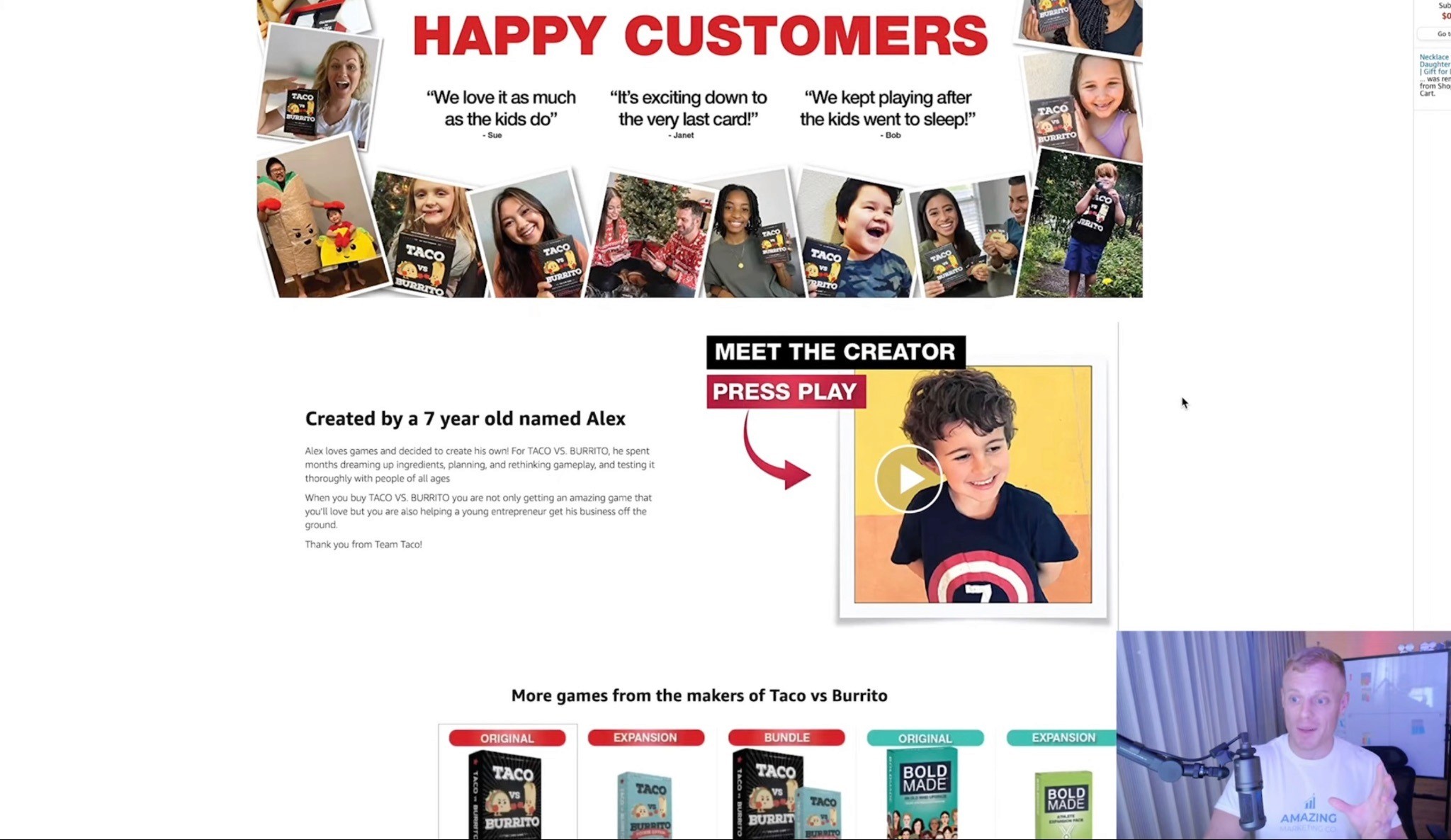
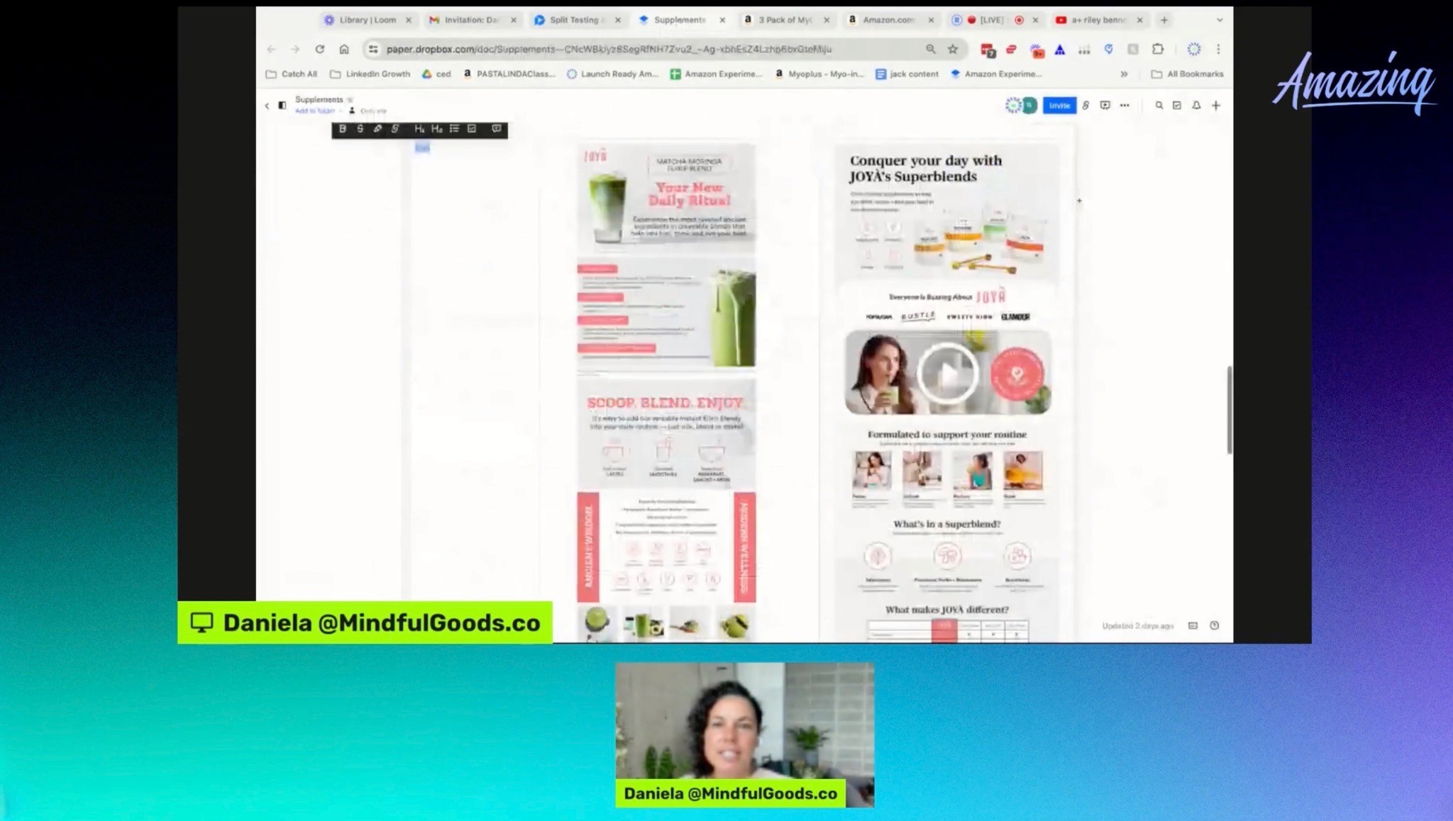
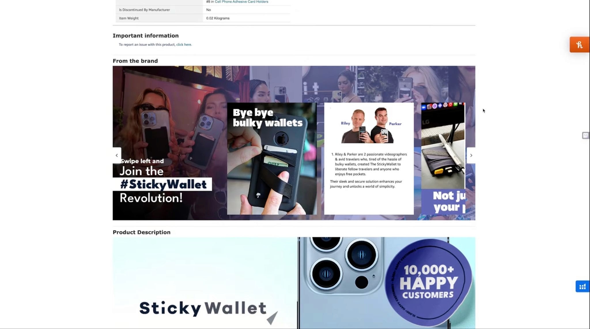
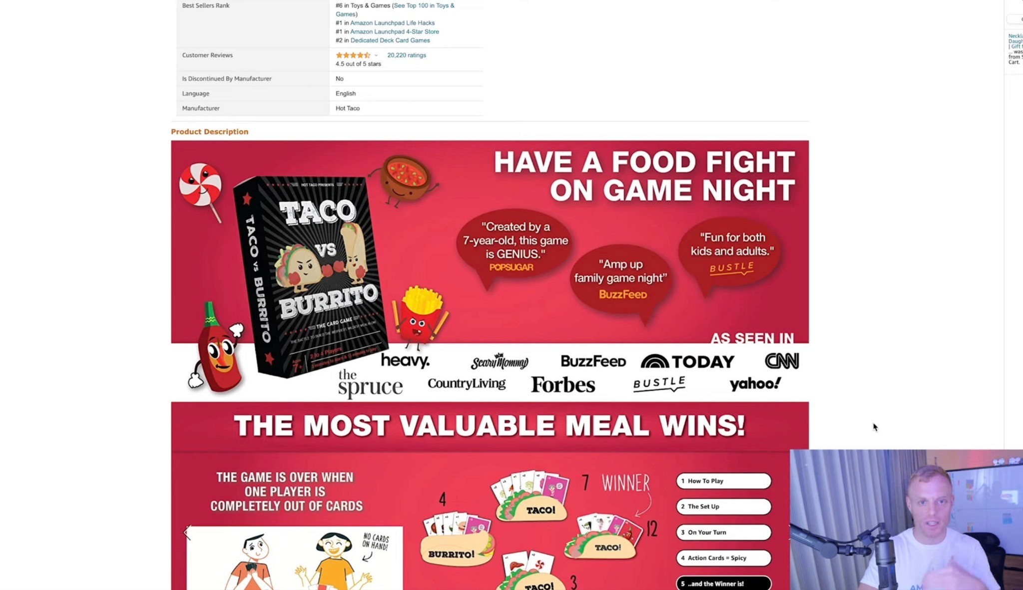
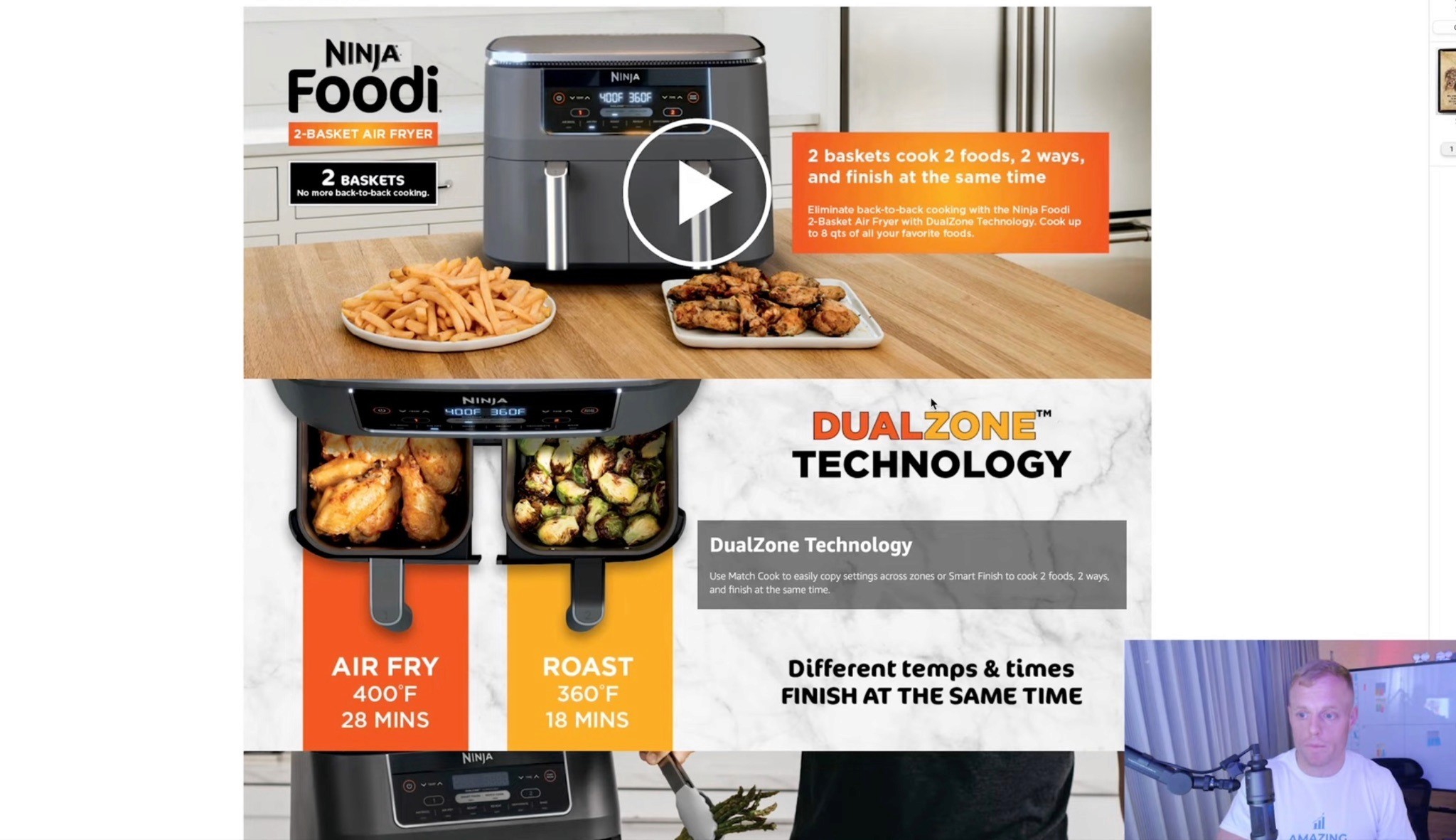
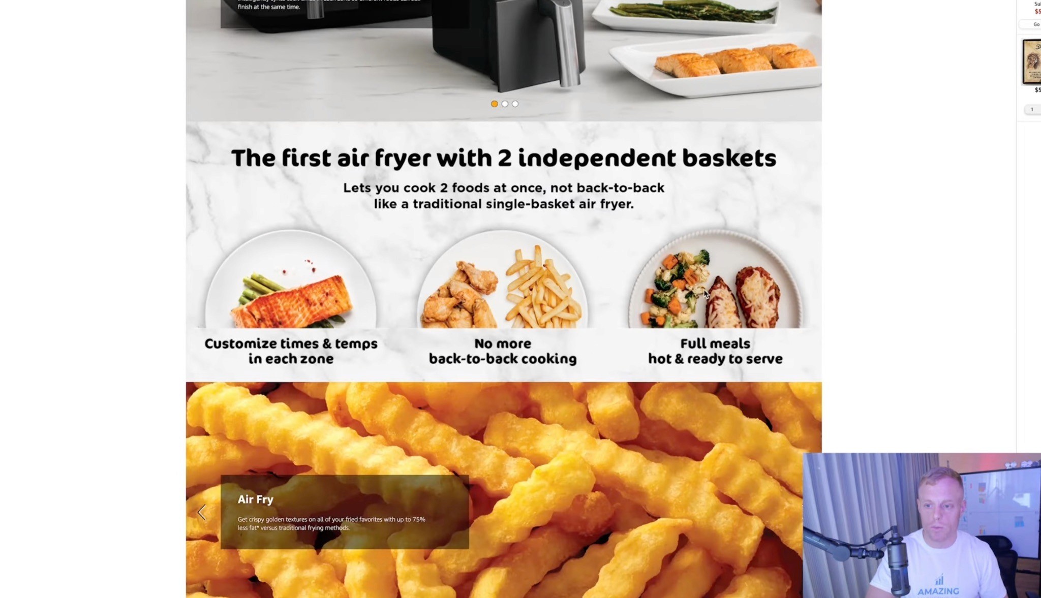
Instead of a narrow stack of static banners, it can create something closer to a complete landing page inside the Amazon listing using wider images, videos, carousels, interactive hotspots, Q&A sections, and stronger comparison modules.
Amazon says well-implemented Premium A+ Content can increase sales by up to 20%, compared with up to 8% for Basic A+ Content.
Access alone does not improve performance, though. The layout still needs strong photography, clear messaging, useful hierarchy, and a logical sales flow.
What Is Premium A+ Content?

Premium A+ Content is the advanced version of Amazon’s A+ Content system.
Depending on the marketplace and options available in your account, it may include:
Full-width image modules
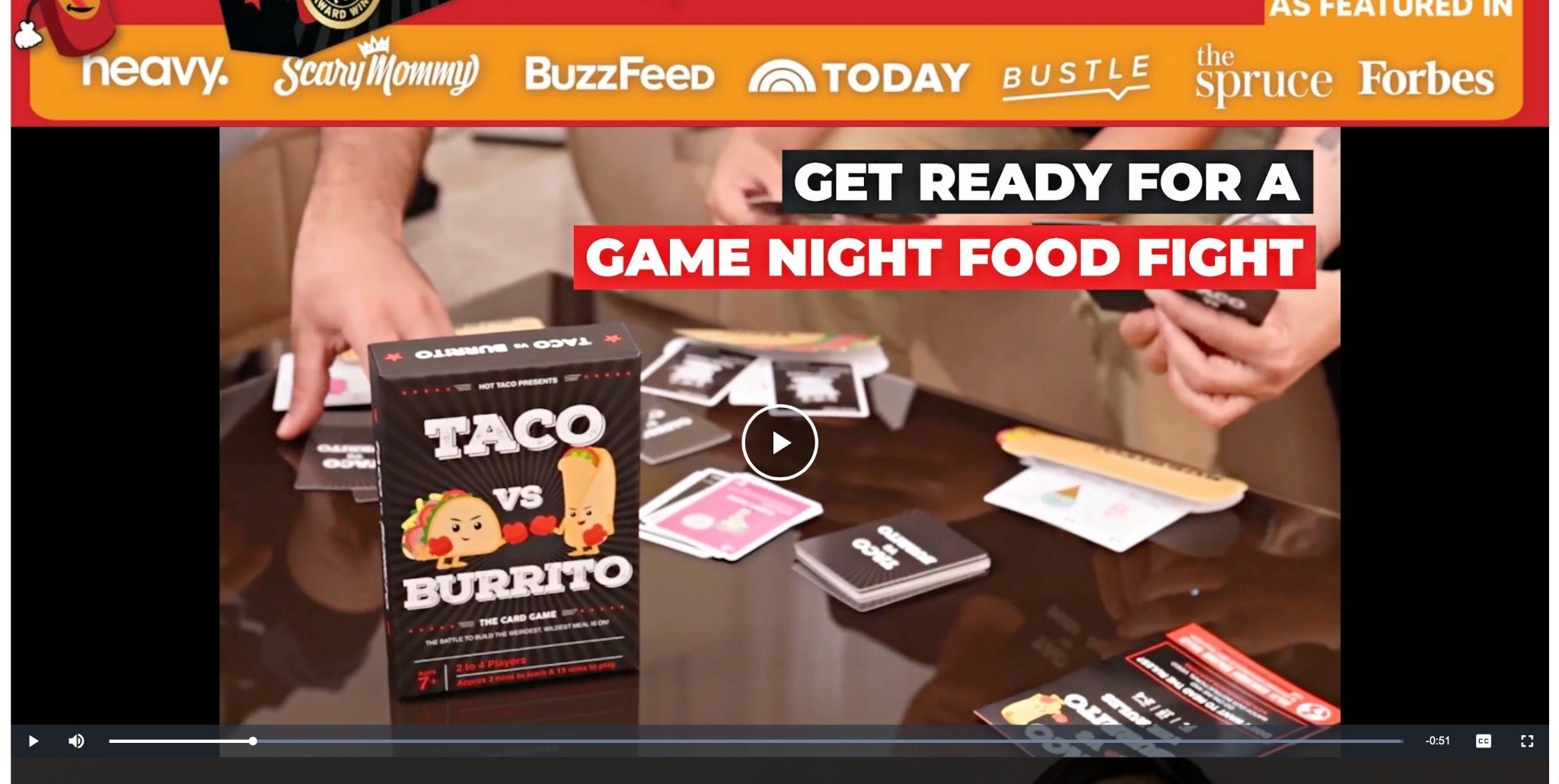
Video and video carousels
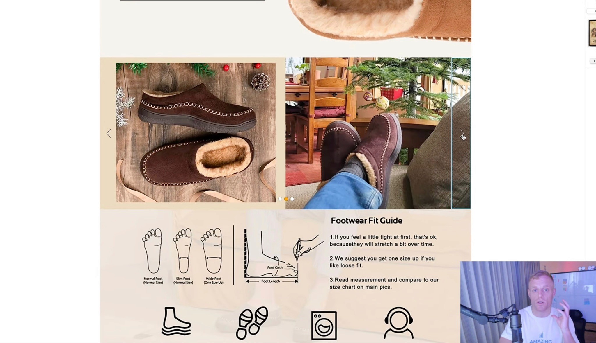
Image carousels
Interactive hotspots
Q&A sections
Enhanced comparison tables
Navigation carousels
Text over imagery
Separate desktop and mobile assets
Its biggest advantage is the ability to turn the lower half of the listing into a more complete sales experience.
You can use it to explain what the product is, why it is different, how it works, whether shoppers can trust it, and which option they should buy.
Basic A+ Content vs. Premium A+ Content

Basic A+ Content
Basic A+ generally includes:
Static images and text
Standard comparison charts
Narrower sections
Smaller modules
Fewer interactive options
More visible gaps between modules
It can still explain features and cross-sell products, but it often feels like separate content blocks stacked down the page.
Premium A+ Content

Premium A+ adds:
Wider visual space
Video inside the A+ section
Carousels and hotspots
Enhanced comparison modules
Better mobile control
More modules per layout
A more seamless ecommerce-page appearance
The larger format is more powerful, but it also makes weak photography and crowded design more obvious.
Current Premium A+ Content Eligibility Requirements

Amazon has changed the requirements several times, which is why older guides may mention 12 or 15 approvals.
The current published requirements are:
A Brand Story must be published on all brand-owned listings.
Your account must have at least five approved A+ Content projects within the past 12 months.
The brand must be enrolled in Amazon Brand Registry.
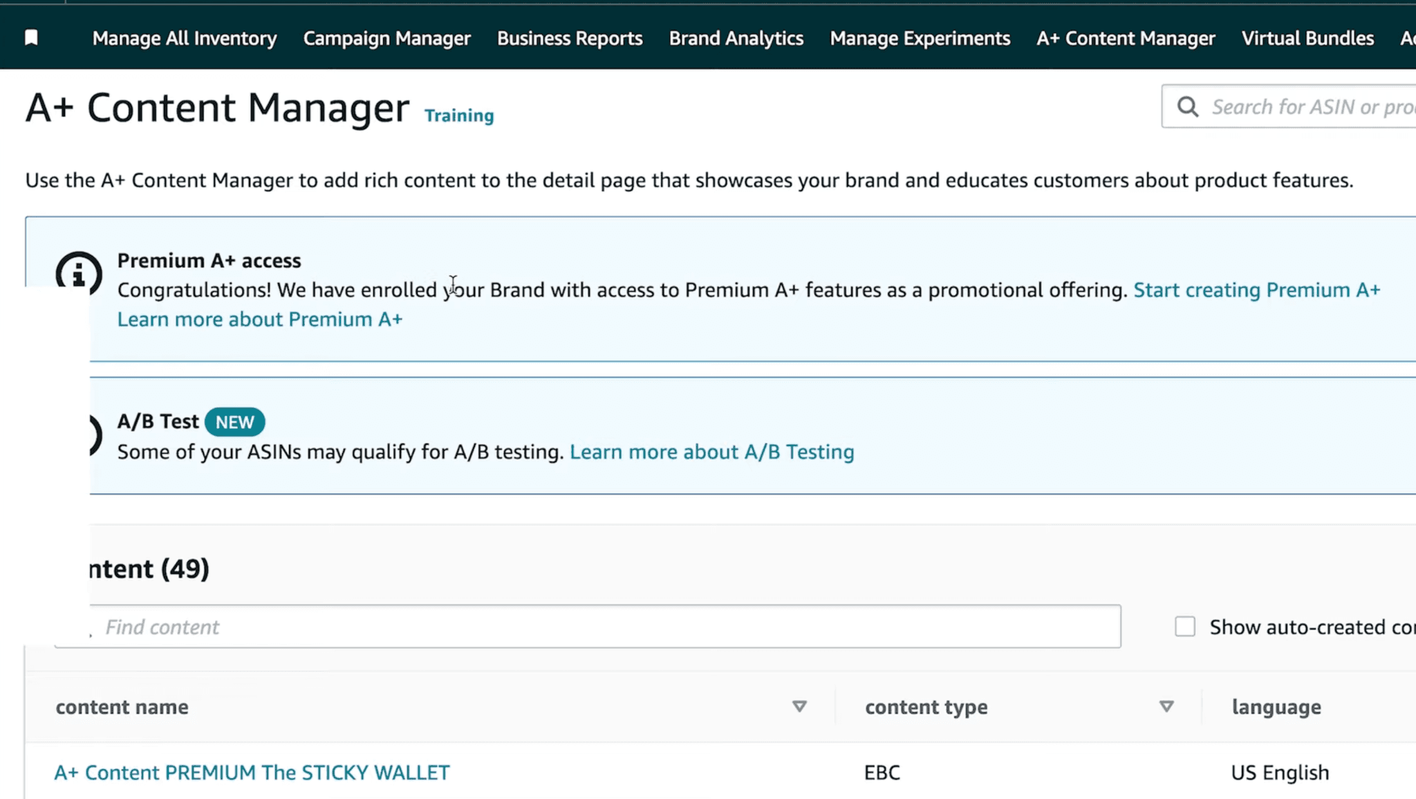
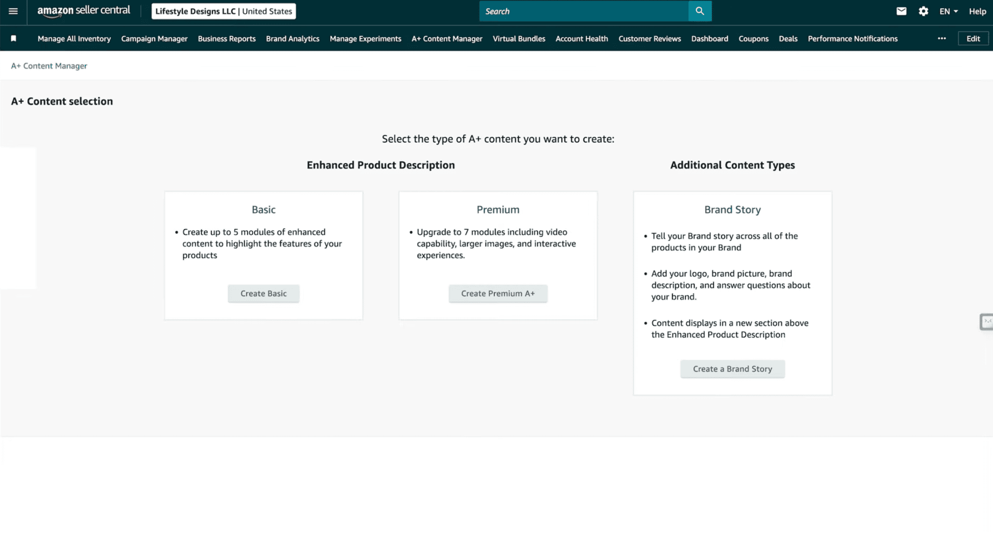
Once Amazon confirms eligibility, a Premium A+ notification should appear inside A+ Content Manager.
Always check Seller Central because Amazon can change access rules, review timing, and module availability.
How to Check Premium A+ Access

In Seller Central, open:
Advertising → A+ Content Manager
Look for:
An eligibility banner
A button such as Start Creating Premium A+ Content
Premium module options when starting a new project
If those options do not appear, confirm that:
The brand is enrolled in Brand Registry.
Brand Story is live on every brand-owned listing.
Five A+ projects were approved in the past 12 months.
Older or inactive ASINs are not missing Brand Story.
Projects are fully approved rather than under review.
Amazon has had time to refresh eligibility.
Access may not appear immediately after completing the requirements.
How to Unlock Premium A+ Content
Step 1: Review Every Brand-Owned ASIN
Check every listing connected to the brand, not only your best sellers.
One older or overlooked ASIN without Brand Story may prevent qualification.
Step 2: Publish a Brand Story

Create a compliant Brand Story and apply it across all brand-owned listings.
It does not need to be your final polished version immediately. You can publish a solid version first and improve the creative later.
Step 3: Confirm Five Approved A+ Projects
Check the status and approval dates inside A+ Content Manager.
Focus on legitimate approved projects rather than relying on duplicate submissions, which Amazon may reject.
Step 4: Wait for Eligibility to Refresh
If access still does not appear, document:
Brand name
Merchant ID
ASINs with Brand Story
Approved project names
Approval dates
Status screenshots
Then contact Seller Support and request an eligibility review.
Is Premium A+ Content Free?
Amazon currently presents A+ Content as free to eligible brands, and Premium A+ has been offered at no cost during an extended promotional period.
Because Amazon has historically described Premium access as promotional, confirm the latest terms inside Seller Central.
Premium A+ Content Modules Explained
You do not need to use every available module.
Choose each one based on what the shopper needs to understand next.
Full-Width Image Modules

Full-width banners work well for:
The primary USP
Major product benefits
Ingredient or material advantages
Lifestyle scenes
Trust or certification claims
Product comparisons
Product-line messaging
Keep each section focused on one idea.
Use large headlines, minimal copy, strong photography, and clear spacing.
Do not stretch Basic A+ graphics into Premium slots. The proportions are different, so most designs need to be rebuilt.
Video Modules

Video can show:
How the product works
How it looks in use
Assembly or installation
Texture or consistency
Founder or brand context
Customer experiences
Differences from alternatives
Place your strongest video early rather than hiding it near the bottom.
Useful formats include product demonstrations, founder videos, commercials, UGC compilations, unboxings, walkthroughs, and recipe or use-case videos.
The thumbnail should clearly show what the shopper will learn.
Image and Video Carousels

Carousels work well for:
Flavors or variations
Different use cases
Instructions
Recipes
Customer types
Product collections
Multiple video formats
Each slide should add new information.
Five nearly identical product shots do not justify an interactive module.
Interactive Hotspots

Hotspots are useful for products with:
Multiple components
Technical details
Ingredients
Controls or ports
Layers or materials
Accessories
Functional zones
Use them for secondary details.
Do not hide the primary USP behind an interaction.
Premium Comparison Tables

Comparison tables can help shoppers choose between:
Products in your catalog
Sizes
Flavors
Strengths
Bundles
Models
Use cases
Compare criteria that genuinely affect the decision, such as quantity, material, ingredients, compatibility, features, intended user, and what is included.
Avoid meaningless rows added only to make your product win.
Q&A Modules

Use Q&A sections for details that do not fit naturally into the visual flow, such as:
Compatibility
Sizing
Storage
Care
Directions
Ingredients
Assembly
What is included
Differences between models
Customer questions, reviews, returns, and support tickets can help identify the most useful topics.
What Strong Premium A+ Examples Have in Common

A Clear USP First
The opening module should answer:
Why should I choose this product over the other options I just saw?
Use a short positioning headline, a clear product visual, relevant lifestyle imagery, and one primary reason to care.
Avoid vague brand statements that could apply to anyone.
A Connected Visual Flow
Strong pages feel consistent from top to bottom through:
Matching typography
Repeated colors
Consistent backgrounds
Similar spacing
Connected shapes
Consistent product presentation
The modules should feel related without repeating the same point.
Strong Product Photography
Premium A+ exposes weak photography because the modules are large.
Use:
Product close-ups
Lifestyle scenes
Product-in-use images
Texture details
Packaging
Ingredients or materials
Models who match the target customer
Wide compositions planned for Premium modules
My Amazon Product Photography Guide explains how to plan studio, lifestyle, close-up, packaging, and in-use assets before the shoot.
Large, Skimmable Headlines
A shopper should understand the main sales story by reading only the headlines.
Use supporting text for shoppers who want more detail, but do not require everyone to read paragraphs.
Proof Beside the Claim

Place trust signals where they are most relevant.
For example:
Testing credentials beside a quality claim
Certifications beside material or ingredient details
Review volume beside customer proof
Guarantees beside the objection they address
Media mentions beside brand-authority messaging
This makes the proof easier to understand and believe.
Useful Interaction
Carousels and hotspots should help shoppers learn something.
Use them for variations, instructions, technical details, recipes, product selection, and secondary videos.
Keep the core sales pitch visible without interaction.
Premium A+ Layout Example

A strong seven-module structure could be:
Module 1: USP Hero
Show the product, a short USP headline, relevant lifestyle imagery, and one supporting line.
Module 2: Product Video
Demonstrate how the product works, who it is for, and why it exists.
Module 3: Why the Difference Matters
Explain the product’s unique mechanism, material, ingredient combination, or construction.
Module 4: Lifestyle or Use-Case Carousel
Show how the product fits into realistic situations.
Module 5: Comparison Section
Compare the product with meaningful alternatives, sizes, models, or catalog options.
Module 6: Proof and Objection Handling
Use testing, certifications, reviews, guarantees, media mentions, or FAQs.
Module 7: Product-Line Comparison
Help shoppers choose the right product without opening several listings.
Use all seven only when every module adds useful information.
For a deeper breakdown of module layouts, creative strategy, examples, and conversion-focused design, see my Amazon Premium A+ Content Guide which includes layout, strategies, examples and more.
How to Plan Premium A+ Before Designing

Do not start by asking which modules look best.
Start with the shopper’s questions.
Understand the Product
Document:
What it does
How it works
Who it is for
Ingredients or materials
Dimensions
What is included
Variations
Use cases
Limitations
Common misunderstandings
Define the USP
Explain in one sentence why the product is meaningfully different from the alternatives.
If the team cannot explain the USP clearly, the designer will struggle to communicate it across the page.
Research the Competition
Review the listings ranking for your main keywords.
Look for:
Repeated claims
Weak explanations
Common layouts
Customer objections
Comparison opportunities
Photography standards
Trust signals
Ways competitors all look the same
The goal is not to copy the top listing. It is to understand what shoppers already see and what your page needs to explain better.
Review Customer Language
Use:
Product and competitor reviews
Customer questions
Return reasons
Support messages
Surveys
Sales-call feedback
These sources often reveal what shoppers actually care about.
Build the Message Sequence
Arrange the page around these questions:
What is it?
Why is it different?
Why does that matter?
How does it work?
Can I trust it?
Is it right for me?
Which version should I buy?
Then choose the module that communicates each answer best.
Gather the Assets
Collect:
Product renders
Packaging files
Lifestyle photography
Product-in-use images
Close-ups
Video
UGC
Certifications
Reviews
Press mentions
Icons
Ingredient or material visuals
Brand guidelines
For broader listing strategy, my Amazon Listing Optimization Guide explains how the title, gallery, bullets, offer, video, and A+ section should work together.
Desktop and Mobile Premium A+ Design
Do not simply shrink the desktop design.
For mobile:
Increase text size.
Shorten headlines.
Keep important details away from the edges.
Keep the product prominent.
Simplify multi-column layouts.
Reduce secondary copy.
Check hotspot placement.
Preview every carousel slide.
Keep comparison tables readable.
Design for mobile from the beginning.
Should You A/B Test Premium A+ Content?

Yes, when the ASIN receives enough traffic.
Amazon’s Manage Your Experiments tool can test A+ Content alongside other listing elements.
A clean test would use:
Existing A+ Content as Version A
New Premium A+ Content as Version B
No major simultaneous title or gallery changes
Testing several elements at once makes it difficult to know what caused the result.
Experiments may still be inconclusive when traffic is low or the versions are too similar.
Frequently Asked Questions
What Is the Difference Between A+ and Premium A+ Content?
Basic A+ provides static images, text, and standard comparison modules.
Premium A+ adds wider layouts, video, carousels, hotspots, Q&A sections, and enhanced comparison tables.
Who Is Eligible for Premium A+ Content?
The current requirements are Brand Story across brand-owned listings, five approved A+ projects in the previous 12 months, and Amazon Brand Registry enrollment.
How Many Modules Can You Use?
Premium A+ layouts can use up to seven modules.
Use all seven only when each section adds useful information.
Can Premium A+ Include Videos?
Yes. Video is one of the main Premium A+ features.
Does Premium A+ Improve Conversion?
It can, but performance depends on strategy and execution.
Amazon says well-implemented Premium A+ may increase sales by up to 20%, but that is not guaranteed for every ASIN.
Can Basic A+ Designs Be Reused?
Usually not without redesigning them.
Premium modules use different proportions, so existing graphics may look stretched or compressed.
Should the First Module Be a Video?
Not automatically.
Use video first when it explains the product faster than a static image. For many products, a clear USP hero followed by video creates a stronger sequence.
Need Premium A+ Content Built Around Conversion?
Choosing the modules is the easy part.
The harder work is deciding what each module should say, which assets it needs, and how the full page should guide the buying decision.
Our Amazon Premium A+ Content service combines product research, competitor analysis, Amazon-focused copywriting, layout strategy, and premium design around the product’s actual USP.
We plan the complete desktop and mobile sales story so every module helps shoppers understand why the product is worth choosing.
Premium A+ Content Examples and Eligibility: Modules, Layouts, and Access
See what Premium A+ offers, how to qualify, and how to build a clear layout.

Premium A+ Content gives brands more room to explain, demonstrate, and sell their products than Basic A+ Content.
Instead of a narrow stack of static banners, it can create something closer to a complete landing page inside the Amazon listing using wider images, videos, carousels, interactive hotspots, Q&A sections, and stronger comparison modules.
Amazon says well-implemented Premium A+ Content can increase sales by up to 20%, compared with up to 8% for Basic A+ Content.
Access alone does not improve performance, though. The layout still needs strong photography, clear messaging, useful hierarchy, and a logical sales flow.
What Is Premium A+ Content?

Premium A+ Content is the advanced version of Amazon’s A+ Content system.
Depending on the marketplace and options available in your account, it may include:
Full-width image modules
Video and video carousels
Image carousels
Interactive hotspots
Q&A sections
Enhanced comparison tables
Navigation carousels
Text over imagery
Separate desktop and mobile assets
Its biggest advantage is the ability to turn the lower half of the listing into a more complete sales experience.
You can use it to explain what the product is, why it is different, how it works, whether shoppers can trust it, and which option they should buy.
Basic A+ Content vs. Premium A+ Content

Basic A+ Content
Basic A+ generally includes:
Static images and text
Standard comparison charts
Narrower sections
Smaller modules
Fewer interactive options
More visible gaps between modules
It can still explain features and cross-sell products, but it often feels like separate content blocks stacked down the page.
Premium A+ Content

Premium A+ adds:
Wider visual space
Video inside the A+ section
Carousels and hotspots
Enhanced comparison modules
Better mobile control
More modules per layout
A more seamless ecommerce-page appearance
The larger format is more powerful, but it also makes weak photography and crowded design more obvious.
Current Premium A+ Content Eligibility Requirements

Amazon has changed the requirements several times, which is why older guides may mention 12 or 15 approvals.
The current published requirements are:
A Brand Story must be published on all brand-owned listings.
Your account must have at least five approved A+ Content projects within the past 12 months.
The brand must be enrolled in Amazon Brand Registry.
Once Amazon confirms eligibility, a Premium A+ notification should appear inside A+ Content Manager.
Always check Seller Central because Amazon can change access rules, review timing, and module availability.
How to Check Premium A+ Access

In Seller Central, open:
Advertising → A+ Content Manager
Look for:
An eligibility banner
A button such as Start Creating Premium A+ Content
Premium module options when starting a new project
If those options do not appear, confirm that:
The brand is enrolled in Brand Registry.
Brand Story is live on every brand-owned listing.
Five A+ projects were approved in the past 12 months.
Older or inactive ASINs are not missing Brand Story.
Projects are fully approved rather than under review.
Amazon has had time to refresh eligibility.
Access may not appear immediately after completing the requirements.
How to Unlock Premium A+ Content
Step 1: Review Every Brand-Owned ASIN
Check every listing connected to the brand, not only your best sellers.
One older or overlooked ASIN without Brand Story may prevent qualification.
Step 2: Publish a Brand Story

Create a compliant Brand Story and apply it across all brand-owned listings.
It does not need to be your final polished version immediately. You can publish a solid version first and improve the creative later.
Step 3: Confirm Five Approved A+ Projects
Check the status and approval dates inside A+ Content Manager.
Focus on legitimate approved projects rather than relying on duplicate submissions, which Amazon may reject.
Step 4: Wait for Eligibility to Refresh
If access still does not appear, document:
Brand name
Merchant ID
ASINs with Brand Story
Approved project names
Approval dates
Status screenshots
Then contact Seller Support and request an eligibility review.
Is Premium A+ Content Free?
Amazon currently presents A+ Content as free to eligible brands, and Premium A+ has been offered at no cost during an extended promotional period.
Because Amazon has historically described Premium access as promotional, confirm the latest terms inside Seller Central.
Premium A+ Content Modules Explained
You do not need to use every available module.
Choose each one based on what the shopper needs to understand next.
Full-Width Image Modules

Full-width banners work well for:
The primary USP
Major product benefits
Ingredient or material advantages
Lifestyle scenes
Trust or certification claims
Product comparisons
Product-line messaging
Keep each section focused on one idea.
Use large headlines, minimal copy, strong photography, and clear spacing.
Do not stretch Basic A+ graphics into Premium slots. The proportions are different, so most designs need to be rebuilt.
Video Modules

Video can show:
How the product works
How it looks in use
Assembly or installation
Texture or consistency
Founder or brand context
Customer experiences
Differences from alternatives
Place your strongest video early rather than hiding it near the bottom.
Useful formats include product demonstrations, founder videos, commercials, UGC compilations, unboxings, walkthroughs, and recipe or use-case videos.
The thumbnail should clearly show what the shopper will learn.
Image and Video Carousels

Carousels work well for:
Flavors or variations
Different use cases
Instructions
Recipes
Customer types
Product collections
Multiple video formats
Each slide should add new information.
Five nearly identical product shots do not justify an interactive module.
Interactive Hotspots

Hotspots are useful for products with:
Multiple components
Technical details
Ingredients
Controls or ports
Layers or materials
Accessories
Functional zones
Use them for secondary details.
Do not hide the primary USP behind an interaction.
Premium Comparison Tables

Comparison tables can help shoppers choose between:
Products in your catalog
Sizes
Flavors
Strengths
Bundles
Models
Use cases
Compare criteria that genuinely affect the decision, such as quantity, material, ingredients, compatibility, features, intended user, and what is included.
Avoid meaningless rows added only to make your product win.
Q&A Modules

Use Q&A sections for details that do not fit naturally into the visual flow, such as:
Compatibility
Sizing
Storage
Care
Directions
Ingredients
Assembly
What is included
Differences between models
Customer questions, reviews, returns, and support tickets can help identify the most useful topics.
What Strong Premium A+ Examples Have in Common

A Clear USP First
The opening module should answer:
Why should I choose this product over the other options I just saw?
Use a short positioning headline, a clear product visual, relevant lifestyle imagery, and one primary reason to care.
Avoid vague brand statements that could apply to anyone.
A Connected Visual Flow
Strong pages feel consistent from top to bottom through:
Matching typography
Repeated colors
Consistent backgrounds
Similar spacing
Connected shapes
Consistent product presentation
The modules should feel related without repeating the same point.
Strong Product Photography
Premium A+ exposes weak photography because the modules are large.
Use:
Product close-ups
Lifestyle scenes
Product-in-use images
Texture details
Packaging
Ingredients or materials
Models who match the target customer
Wide compositions planned for Premium modules
My Amazon Product Photography Guide explains how to plan studio, lifestyle, close-up, packaging, and in-use assets before the shoot.
Large, Skimmable Headlines
A shopper should understand the main sales story by reading only the headlines.
Use supporting text for shoppers who want more detail, but do not require everyone to read paragraphs.
Proof Beside the Claim

Place trust signals where they are most relevant.
For example:
Testing credentials beside a quality claim
Certifications beside material or ingredient details
Review volume beside customer proof
Guarantees beside the objection they address
Media mentions beside brand-authority messaging
This makes the proof easier to understand and believe.
Useful Interaction
Carousels and hotspots should help shoppers learn something.
Use them for variations, instructions, technical details, recipes, product selection, and secondary videos.
Keep the core sales pitch visible without interaction.
Premium A+ Layout Example

A strong seven-module structure could be:
Module 1: USP Hero
Show the product, a short USP headline, relevant lifestyle imagery, and one supporting line.
Module 2: Product Video
Demonstrate how the product works, who it is for, and why it exists.
Module 3: Why the Difference Matters
Explain the product’s unique mechanism, material, ingredient combination, or construction.
Module 4: Lifestyle or Use-Case Carousel
Show how the product fits into realistic situations.
Module 5: Comparison Section
Compare the product with meaningful alternatives, sizes, models, or catalog options.
Module 6: Proof and Objection Handling
Use testing, certifications, reviews, guarantees, media mentions, or FAQs.
Module 7: Product-Line Comparison
Help shoppers choose the right product without opening several listings.
Use all seven only when every module adds useful information.
For a deeper breakdown of module layouts, creative strategy, examples, and conversion-focused design, see my Amazon Premium A+ Content Guide which includes layout, strategies, examples and more.
How to Plan Premium A+ Before Designing

Do not start by asking which modules look best.
Start with the shopper’s questions.
Understand the Product
Document:
What it does
How it works
Who it is for
Ingredients or materials
Dimensions
What is included
Variations
Use cases
Limitations
Common misunderstandings
Define the USP
Explain in one sentence why the product is meaningfully different from the alternatives.
If the team cannot explain the USP clearly, the designer will struggle to communicate it across the page.
Research the Competition
Review the listings ranking for your main keywords.
Look for:
Repeated claims
Weak explanations
Common layouts
Customer objections
Comparison opportunities
Photography standards
Trust signals
Ways competitors all look the same
The goal is not to copy the top listing. It is to understand what shoppers already see and what your page needs to explain better.
Review Customer Language
Use:
Product and competitor reviews
Customer questions
Return reasons
Support messages
Surveys
Sales-call feedback
These sources often reveal what shoppers actually care about.
Build the Message Sequence
Arrange the page around these questions:
What is it?
Why is it different?
Why does that matter?
How does it work?
Can I trust it?
Is it right for me?
Which version should I buy?
Then choose the module that communicates each answer best.
Gather the Assets
Collect:
Product renders
Packaging files
Lifestyle photography
Product-in-use images
Close-ups
Video
UGC
Certifications
Reviews
Press mentions
Icons
Ingredient or material visuals
Brand guidelines
For broader listing strategy, my Amazon Listing Optimization Guide explains how the title, gallery, bullets, offer, video, and A+ section should work together.
Desktop and Mobile Premium A+ Design
Do not simply shrink the desktop design.
For mobile:
Increase text size.
Shorten headlines.
Keep important details away from the edges.
Keep the product prominent.
Simplify multi-column layouts.
Reduce secondary copy.
Check hotspot placement.
Preview every carousel slide.
Keep comparison tables readable.
Design for mobile from the beginning.
Should You A/B Test Premium A+ Content?

Yes, when the ASIN receives enough traffic.
Amazon’s Manage Your Experiments tool can test A+ Content alongside other listing elements.
A clean test would use:
Existing A+ Content as Version A
New Premium A+ Content as Version B
No major simultaneous title or gallery changes
Testing several elements at once makes it difficult to know what caused the result.
Experiments may still be inconclusive when traffic is low or the versions are too similar.
Frequently Asked Questions
What Is the Difference Between A+ and Premium A+ Content?
Basic A+ provides static images, text, and standard comparison modules.
Premium A+ adds wider layouts, video, carousels, hotspots, Q&A sections, and enhanced comparison tables.
Who Is Eligible for Premium A+ Content?
The current requirements are Brand Story across brand-owned listings, five approved A+ projects in the previous 12 months, and Amazon Brand Registry enrollment.
How Many Modules Can You Use?
Premium A+ layouts can use up to seven modules.
Use all seven only when each section adds useful information.
Can Premium A+ Include Videos?
Yes. Video is one of the main Premium A+ features.
Does Premium A+ Improve Conversion?
It can, but performance depends on strategy and execution.
Amazon says well-implemented Premium A+ may increase sales by up to 20%, but that is not guaranteed for every ASIN.
Can Basic A+ Designs Be Reused?
Usually not without redesigning them.
Premium modules use different proportions, so existing graphics may look stretched or compressed.
Should the First Module Be a Video?
Not automatically.
Use video first when it explains the product faster than a static image. For many products, a clear USP hero followed by video creates a stronger sequence.
Need Premium A+ Content Built Around Conversion?
Choosing the modules is the easy part.
The harder work is deciding what each module should say, which assets it needs, and how the full page should guide the buying decision.
Our Amazon Premium A+ Content service combines product research, competitor analysis, Amazon-focused copywriting, layout strategy, and premium design around the product’s actual USP.
We plan the complete desktop and mobile sales story so every module helps shoppers understand why the product is worth choosing.
Premium A+ Content Examples and Eligibility: Modules, Layouts, and Access
See what Premium A+ offers, how to qualify, and how to build a clear layout.

Premium A+ Content gives brands more room to explain, demonstrate, and sell their products than Basic A+ Content.
Instead of a narrow stack of static banners, it can create something closer to a complete landing page inside the Amazon listing using wider images, videos, carousels, interactive hotspots, Q&A sections, and stronger comparison modules.
Amazon says well-implemented Premium A+ Content can increase sales by up to 20%, compared with up to 8% for Basic A+ Content.
Access alone does not improve performance, though. The layout still needs strong photography, clear messaging, useful hierarchy, and a logical sales flow.
What Is Premium A+ Content?

Premium A+ Content is the advanced version of Amazon’s A+ Content system.
Depending on the marketplace and options available in your account, it may include:
Full-width image modules
Video and video carousels
Image carousels
Interactive hotspots
Q&A sections
Enhanced comparison tables
Navigation carousels
Text over imagery
Separate desktop and mobile assets
Its biggest advantage is the ability to turn the lower half of the listing into a more complete sales experience.
You can use it to explain what the product is, why it is different, how it works, whether shoppers can trust it, and which option they should buy.
Basic A+ Content vs. Premium A+ Content

Basic A+ Content
Basic A+ generally includes:
Static images and text
Standard comparison charts
Narrower sections
Smaller modules
Fewer interactive options
More visible gaps between modules
It can still explain features and cross-sell products, but it often feels like separate content blocks stacked down the page.
Premium A+ Content

Premium A+ adds:
Wider visual space
Video inside the A+ section
Carousels and hotspots
Enhanced comparison modules
Better mobile control
More modules per layout
A more seamless ecommerce-page appearance
The larger format is more powerful, but it also makes weak photography and crowded design more obvious.
Current Premium A+ Content Eligibility Requirements

Amazon has changed the requirements several times, which is why older guides may mention 12 or 15 approvals.
The current published requirements are:
A Brand Story must be published on all brand-owned listings.
Your account must have at least five approved A+ Content projects within the past 12 months.
The brand must be enrolled in Amazon Brand Registry.
Once Amazon confirms eligibility, a Premium A+ notification should appear inside A+ Content Manager.
Always check Seller Central because Amazon can change access rules, review timing, and module availability.
How to Check Premium A+ Access

In Seller Central, open:
Advertising → A+ Content Manager
Look for:
An eligibility banner
A button such as Start Creating Premium A+ Content
Premium module options when starting a new project
If those options do not appear, confirm that:
The brand is enrolled in Brand Registry.
Brand Story is live on every brand-owned listing.
Five A+ projects were approved in the past 12 months.
Older or inactive ASINs are not missing Brand Story.
Projects are fully approved rather than under review.
Amazon has had time to refresh eligibility.
Access may not appear immediately after completing the requirements.
How to Unlock Premium A+ Content
Step 1: Review Every Brand-Owned ASIN
Check every listing connected to the brand, not only your best sellers.
One older or overlooked ASIN without Brand Story may prevent qualification.
Step 2: Publish a Brand Story

Create a compliant Brand Story and apply it across all brand-owned listings.
It does not need to be your final polished version immediately. You can publish a solid version first and improve the creative later.
Step 3: Confirm Five Approved A+ Projects
Check the status and approval dates inside A+ Content Manager.
Focus on legitimate approved projects rather than relying on duplicate submissions, which Amazon may reject.
Step 4: Wait for Eligibility to Refresh
If access still does not appear, document:
Brand name
Merchant ID
ASINs with Brand Story
Approved project names
Approval dates
Status screenshots
Then contact Seller Support and request an eligibility review.
Is Premium A+ Content Free?
Amazon currently presents A+ Content as free to eligible brands, and Premium A+ has been offered at no cost during an extended promotional period.
Because Amazon has historically described Premium access as promotional, confirm the latest terms inside Seller Central.
Premium A+ Content Modules Explained
You do not need to use every available module.
Choose each one based on what the shopper needs to understand next.
Full-Width Image Modules

Full-width banners work well for:
The primary USP
Major product benefits
Ingredient or material advantages
Lifestyle scenes
Trust or certification claims
Product comparisons
Product-line messaging
Keep each section focused on one idea.
Use large headlines, minimal copy, strong photography, and clear spacing.
Do not stretch Basic A+ graphics into Premium slots. The proportions are different, so most designs need to be rebuilt.
Video Modules

Video can show:
How the product works
How it looks in use
Assembly or installation
Texture or consistency
Founder or brand context
Customer experiences
Differences from alternatives
Place your strongest video early rather than hiding it near the bottom.
Useful formats include product demonstrations, founder videos, commercials, UGC compilations, unboxings, walkthroughs, and recipe or use-case videos.
The thumbnail should clearly show what the shopper will learn.
Image and Video Carousels

Carousels work well for:
Flavors or variations
Different use cases
Instructions
Recipes
Customer types
Product collections
Multiple video formats
Each slide should add new information.
Five nearly identical product shots do not justify an interactive module.
Interactive Hotspots

Hotspots are useful for products with:
Multiple components
Technical details
Ingredients
Controls or ports
Layers or materials
Accessories
Functional zones
Use them for secondary details.
Do not hide the primary USP behind an interaction.
Premium Comparison Tables

Comparison tables can help shoppers choose between:
Products in your catalog
Sizes
Flavors
Strengths
Bundles
Models
Use cases
Compare criteria that genuinely affect the decision, such as quantity, material, ingredients, compatibility, features, intended user, and what is included.
Avoid meaningless rows added only to make your product win.
Q&A Modules

Use Q&A sections for details that do not fit naturally into the visual flow, such as:
Compatibility
Sizing
Storage
Care
Directions
Ingredients
Assembly
What is included
Differences between models
Customer questions, reviews, returns, and support tickets can help identify the most useful topics.
What Strong Premium A+ Examples Have in Common

A Clear USP First
The opening module should answer:
Why should I choose this product over the other options I just saw?
Use a short positioning headline, a clear product visual, relevant lifestyle imagery, and one primary reason to care.
Avoid vague brand statements that could apply to anyone.
A Connected Visual Flow
Strong pages feel consistent from top to bottom through:
Matching typography
Repeated colors
Consistent backgrounds
Similar spacing
Connected shapes
Consistent product presentation
The modules should feel related without repeating the same point.
Strong Product Photography
Premium A+ exposes weak photography because the modules are large.
Use:
Product close-ups
Lifestyle scenes
Product-in-use images
Texture details
Packaging
Ingredients or materials
Models who match the target customer
Wide compositions planned for Premium modules
My Amazon Product Photography Guide explains how to plan studio, lifestyle, close-up, packaging, and in-use assets before the shoot.
Large, Skimmable Headlines
A shopper should understand the main sales story by reading only the headlines.
Use supporting text for shoppers who want more detail, but do not require everyone to read paragraphs.
Proof Beside the Claim

Place trust signals where they are most relevant.
For example:
Testing credentials beside a quality claim
Certifications beside material or ingredient details
Review volume beside customer proof
Guarantees beside the objection they address
Media mentions beside brand-authority messaging
This makes the proof easier to understand and believe.
Useful Interaction
Carousels and hotspots should help shoppers learn something.
Use them for variations, instructions, technical details, recipes, product selection, and secondary videos.
Keep the core sales pitch visible without interaction.
Premium A+ Layout Example

A strong seven-module structure could be:
Module 1: USP Hero
Show the product, a short USP headline, relevant lifestyle imagery, and one supporting line.
Module 2: Product Video
Demonstrate how the product works, who it is for, and why it exists.
Module 3: Why the Difference Matters
Explain the product’s unique mechanism, material, ingredient combination, or construction.
Module 4: Lifestyle or Use-Case Carousel
Show how the product fits into realistic situations.
Module 5: Comparison Section
Compare the product with meaningful alternatives, sizes, models, or catalog options.
Module 6: Proof and Objection Handling
Use testing, certifications, reviews, guarantees, media mentions, or FAQs.
Module 7: Product-Line Comparison
Help shoppers choose the right product without opening several listings.
Use all seven only when every module adds useful information.
For a deeper breakdown of module layouts, creative strategy, examples, and conversion-focused design, see my Amazon Premium A+ Content Guide which includes layout, strategies, examples and more.
How to Plan Premium A+ Before Designing

Do not start by asking which modules look best.
Start with the shopper’s questions.
Understand the Product
Document:
What it does
How it works
Who it is for
Ingredients or materials
Dimensions
What is included
Variations
Use cases
Limitations
Common misunderstandings
Define the USP
Explain in one sentence why the product is meaningfully different from the alternatives.
If the team cannot explain the USP clearly, the designer will struggle to communicate it across the page.
Research the Competition
Review the listings ranking for your main keywords.
Look for:
Repeated claims
Weak explanations
Common layouts
Customer objections
Comparison opportunities
Photography standards
Trust signals
Ways competitors all look the same
The goal is not to copy the top listing. It is to understand what shoppers already see and what your page needs to explain better.
Review Customer Language
Use:
Product and competitor reviews
Customer questions
Return reasons
Support messages
Surveys
Sales-call feedback
These sources often reveal what shoppers actually care about.
Build the Message Sequence
Arrange the page around these questions:
What is it?
Why is it different?
Why does that matter?
How does it work?
Can I trust it?
Is it right for me?
Which version should I buy?
Then choose the module that communicates each answer best.
Gather the Assets
Collect:
Product renders
Packaging files
Lifestyle photography
Product-in-use images
Close-ups
Video
UGC
Certifications
Reviews
Press mentions
Icons
Ingredient or material visuals
Brand guidelines
For broader listing strategy, my Amazon Listing Optimization Guide explains how the title, gallery, bullets, offer, video, and A+ section should work together.
Desktop and Mobile Premium A+ Design
Do not simply shrink the desktop design.
For mobile:
Increase text size.
Shorten headlines.
Keep important details away from the edges.
Keep the product prominent.
Simplify multi-column layouts.
Reduce secondary copy.
Check hotspot placement.
Preview every carousel slide.
Keep comparison tables readable.
Design for mobile from the beginning.
Should You A/B Test Premium A+ Content?

Yes, when the ASIN receives enough traffic.
Amazon’s Manage Your Experiments tool can test A+ Content alongside other listing elements.
A clean test would use:
Existing A+ Content as Version A
New Premium A+ Content as Version B
No major simultaneous title or gallery changes
Testing several elements at once makes it difficult to know what caused the result.
Experiments may still be inconclusive when traffic is low or the versions are too similar.
Frequently Asked Questions
What Is the Difference Between A+ and Premium A+ Content?
Basic A+ provides static images, text, and standard comparison modules.
Premium A+ adds wider layouts, video, carousels, hotspots, Q&A sections, and enhanced comparison tables.
Who Is Eligible for Premium A+ Content?
The current requirements are Brand Story across brand-owned listings, five approved A+ projects in the previous 12 months, and Amazon Brand Registry enrollment.
How Many Modules Can You Use?
Premium A+ layouts can use up to seven modules.
Use all seven only when each section adds useful information.
Can Premium A+ Include Videos?
Yes. Video is one of the main Premium A+ features.
Does Premium A+ Improve Conversion?
It can, but performance depends on strategy and execution.
Amazon says well-implemented Premium A+ may increase sales by up to 20%, but that is not guaranteed for every ASIN.
Can Basic A+ Designs Be Reused?
Usually not without redesigning them.
Premium modules use different proportions, so existing graphics may look stretched or compressed.
Should the First Module Be a Video?
Not automatically.
Use video first when it explains the product faster than a static image. For many products, a clear USP hero followed by video creates a stronger sequence.
Need Premium A+ Content Built Around Conversion?
Choosing the modules is the easy part.
The harder work is deciding what each module should say, which assets it needs, and how the full page should guide the buying decision.
Our Amazon Premium A+ Content service combines product research, competitor analysis, Amazon-focused copywriting, layout strategy, and premium design around the product’s actual USP.
We plan the complete desktop and mobile sales story so every module helps shoppers understand why the product is worth choosing.

Riley Bennett
Amazon Strategist, 7-Figure Seller & Founder of AmazingCreative
Riley has been selling on Amazon and working with marketplace brands since 2015. He founded AmazingCreative to help brands improve their listings through stronger creative, clearer messaging, and conversion-focused strategy.
He has worked with more than 300 brands across Amazon CRO, PPC, SEO, product launches, and marketplace growth.
Since 2015 · Trusted by 300+ Brands · 7-Figure Amazon Seller